Axinn
brand identity / digital design / branding / website
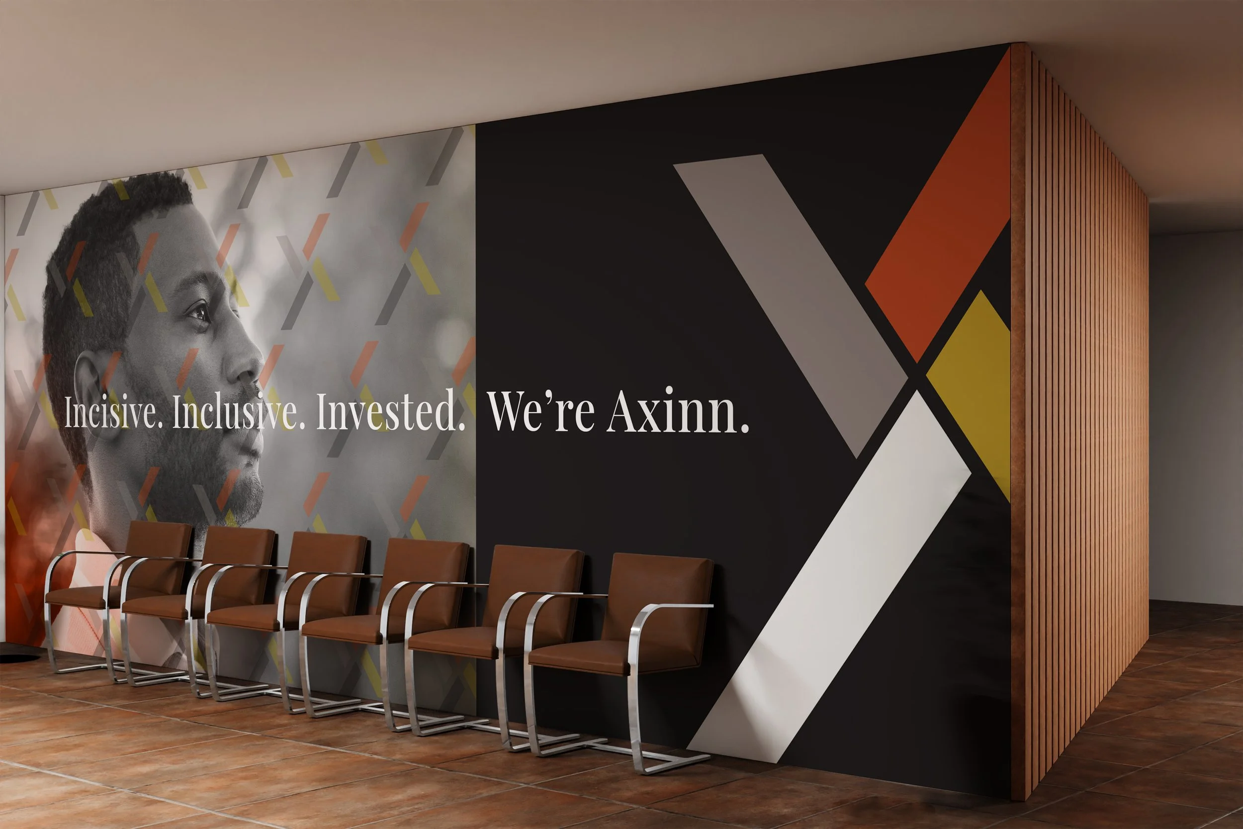
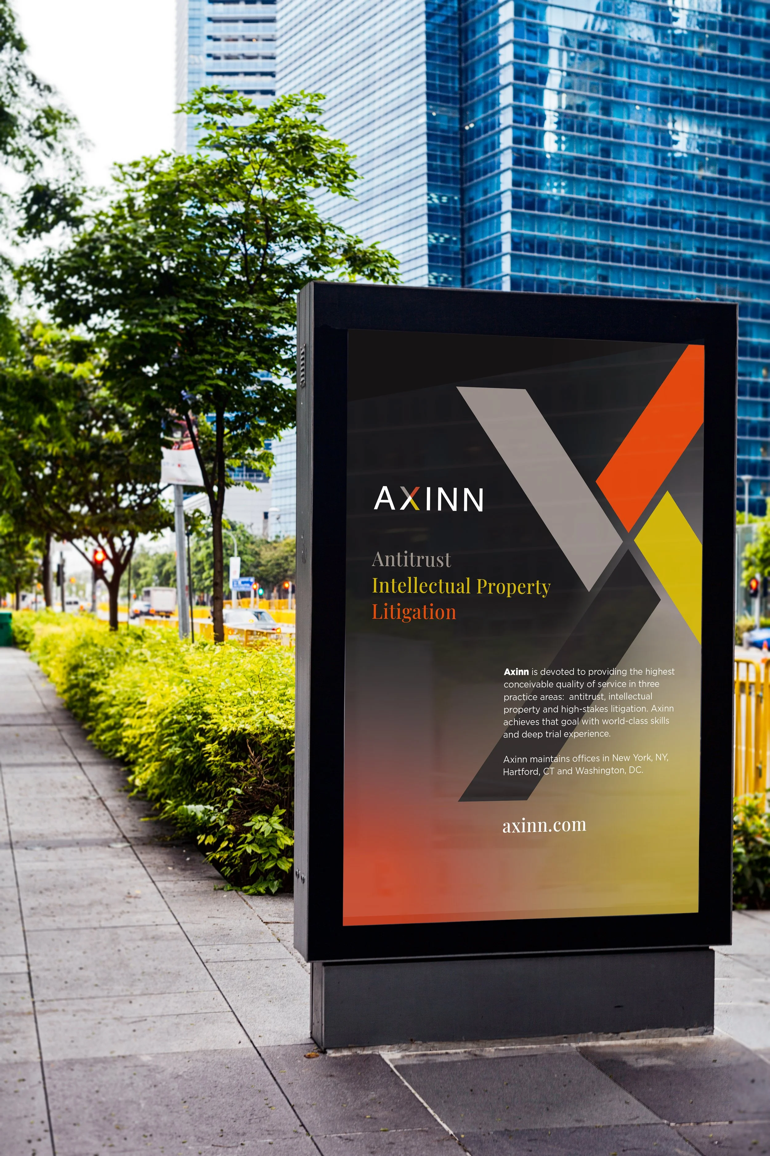
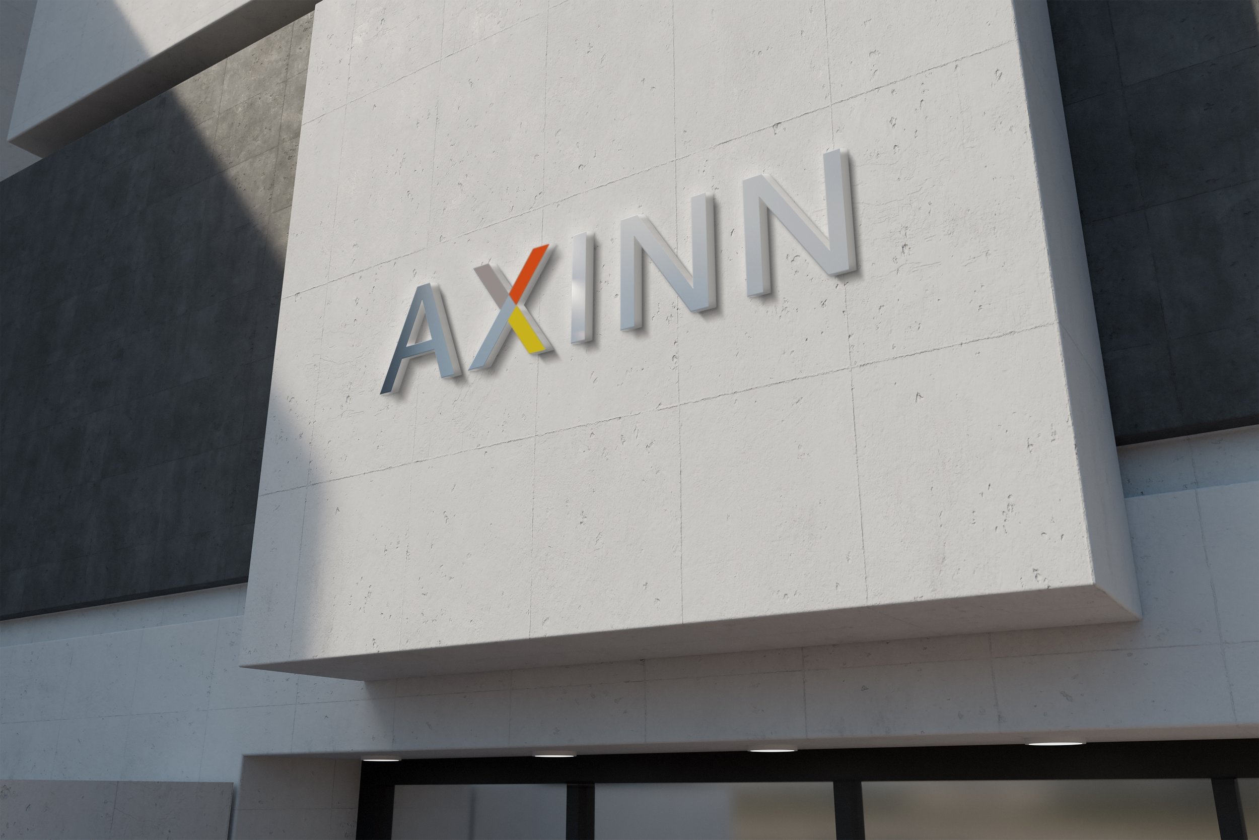
The rebrand for Axinn centers on the strength and structure of the X within the logo, transforming it into a powerful expression of the firm’s core expertise. Four distinct elements come together to form the X within the logo, each representing one of the firm’s key practice areas: antitrust, intellectual property, litigation and the forth is the company it’s self. These elements intersect to create a bold centerpiece. The result is a refined, confident identity that reflects Axinn’s bold and focused expertise while reinforcing the interconnected nature of its services, positioning the firm as sharp, cohesive, and formidable in complex legal landscapes.

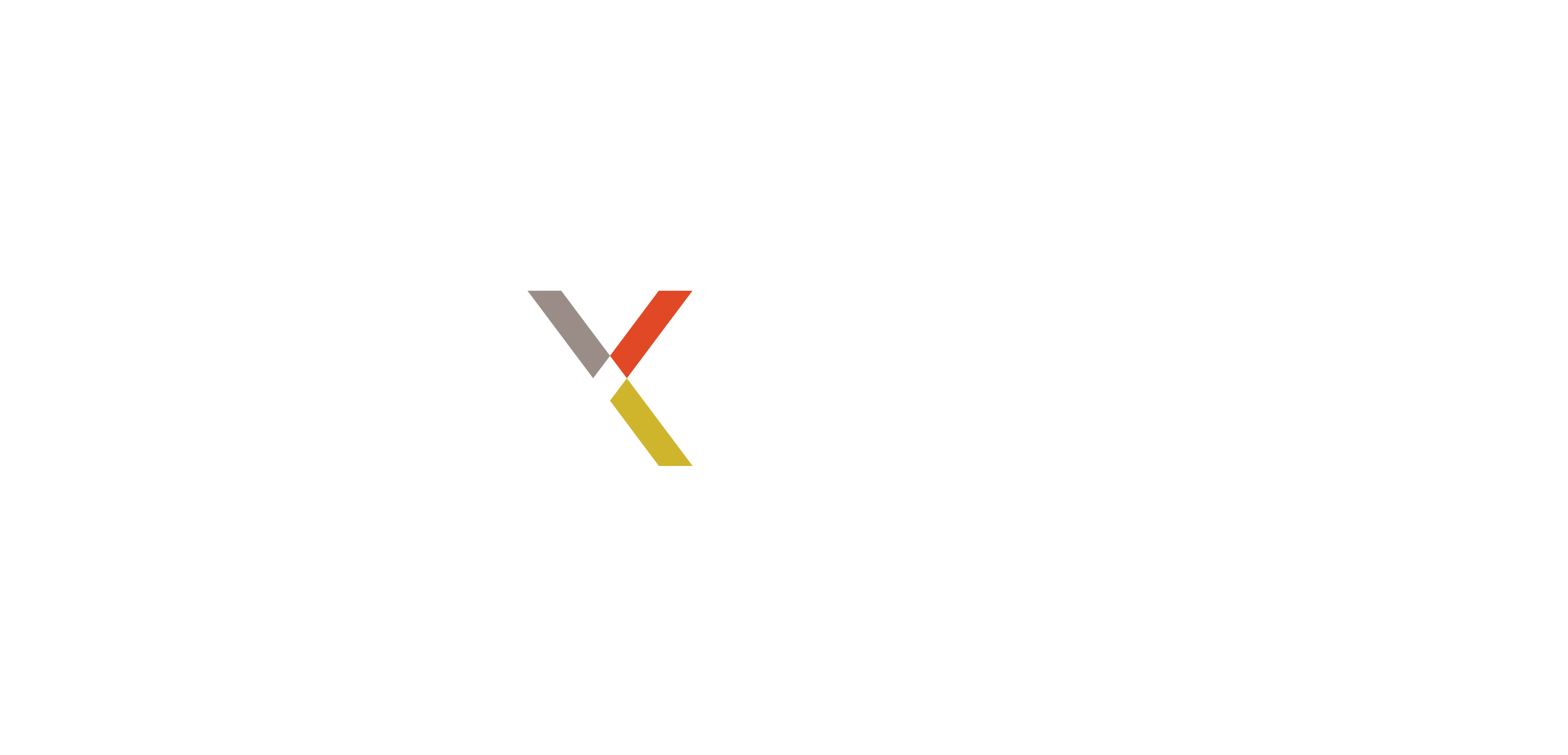


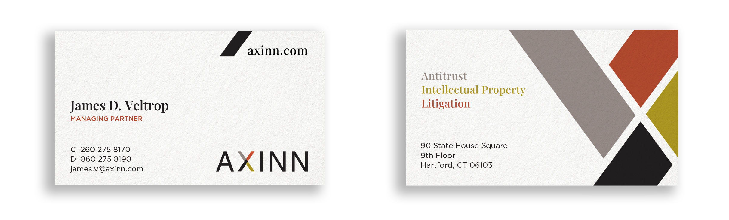

A graphic is directly formed from the X within the logo, transforming a single letterform into a bold and flexible visual device. By extracting and refining its angles, the design amplifies the strength and symmetry already present in the mark, creating a striking graphic element that feels both intentional and dynamic. The intersecting lines become more than typography, they act as a structural framework that can expand, crop, repeat, or layer across applications. The four individual elements drawn from the original X are separated and repositioned to create a new, unified X at the centre. Each segment retains the precise angles and proportions of the logo mark, ensuring consistency, while their arrangement introduces depth and movement. This construction not only strengthens the visual identity but also symbolises connection and cohesion, with every part working together to build the brand’s core mark.


Proposal