BIGBOX storage
logo design / website design / branding / illustrations / apparel design
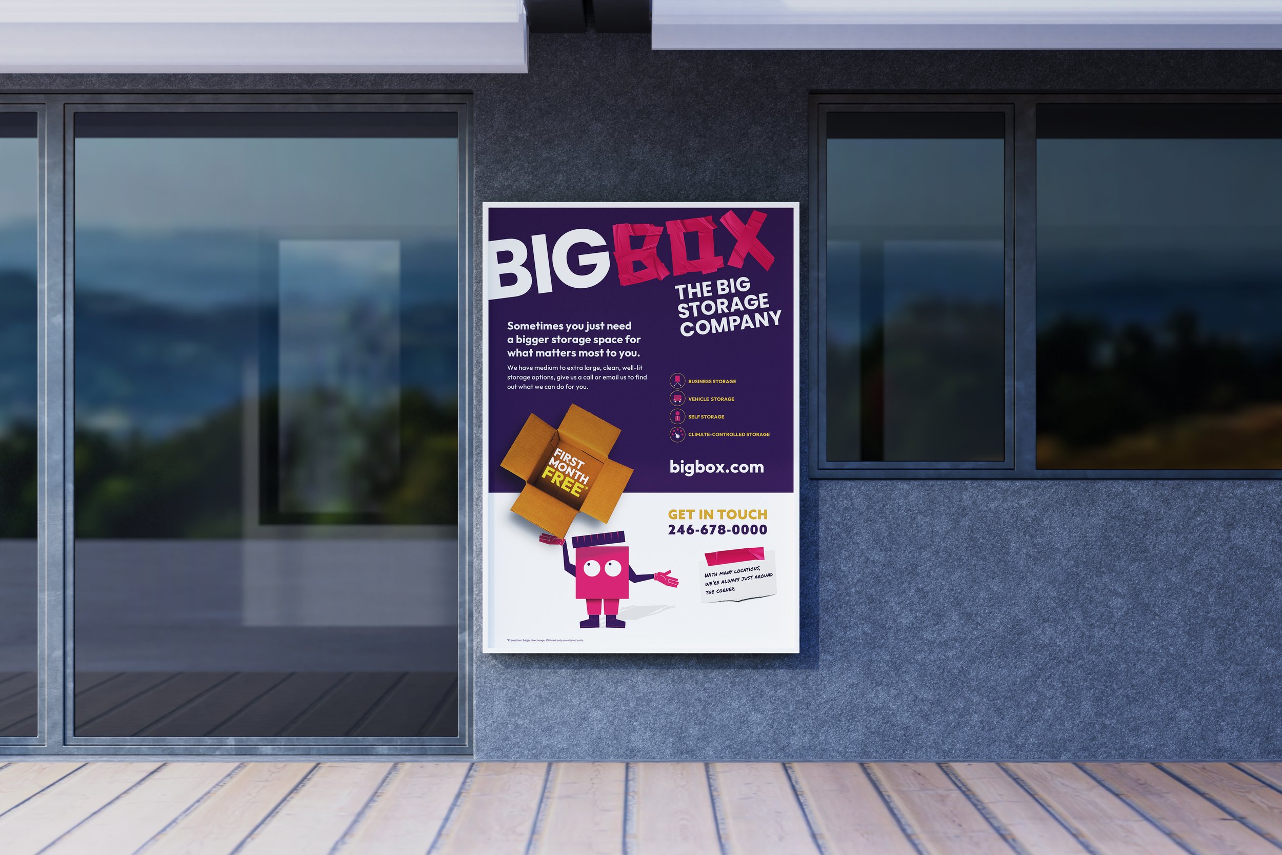
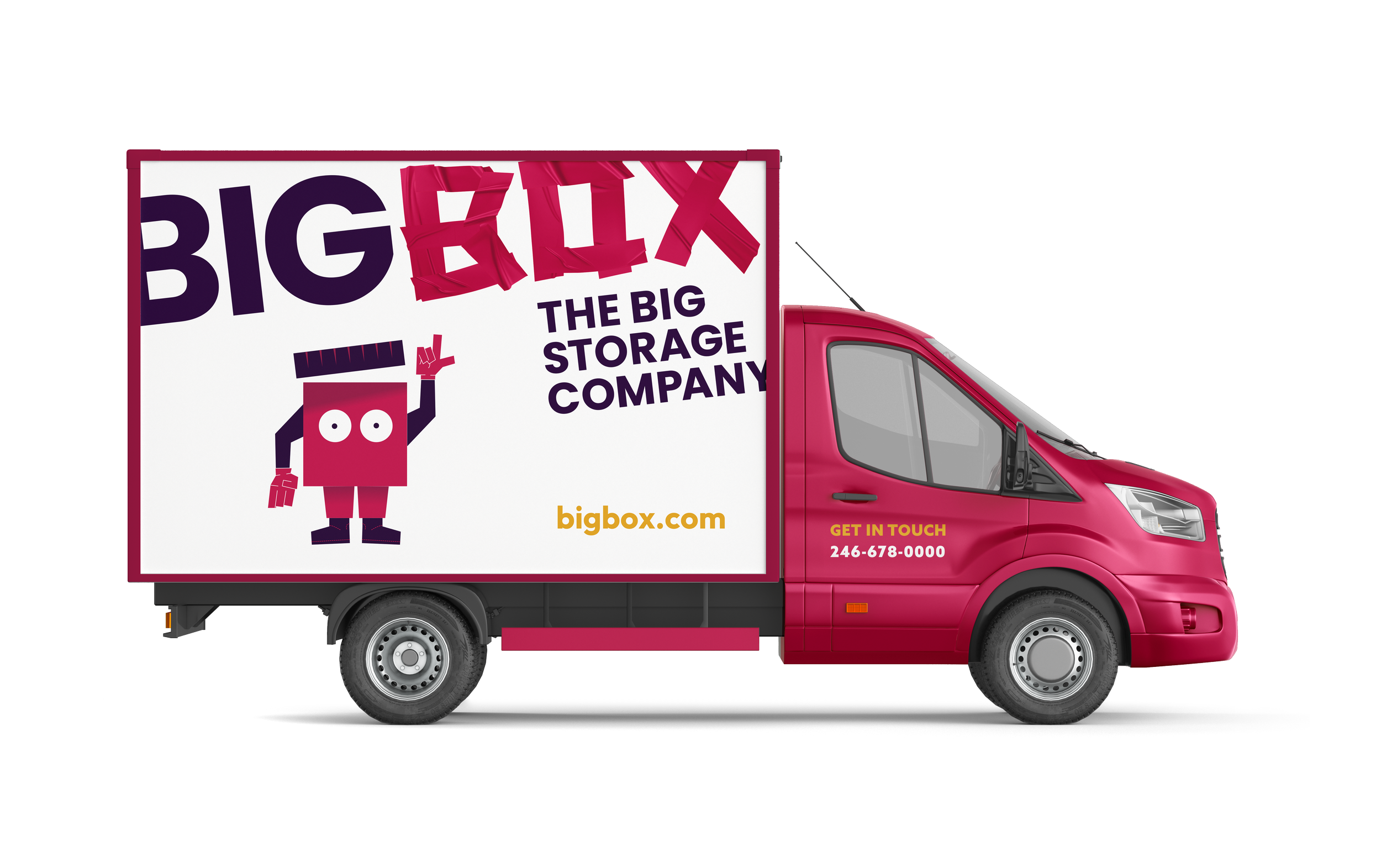
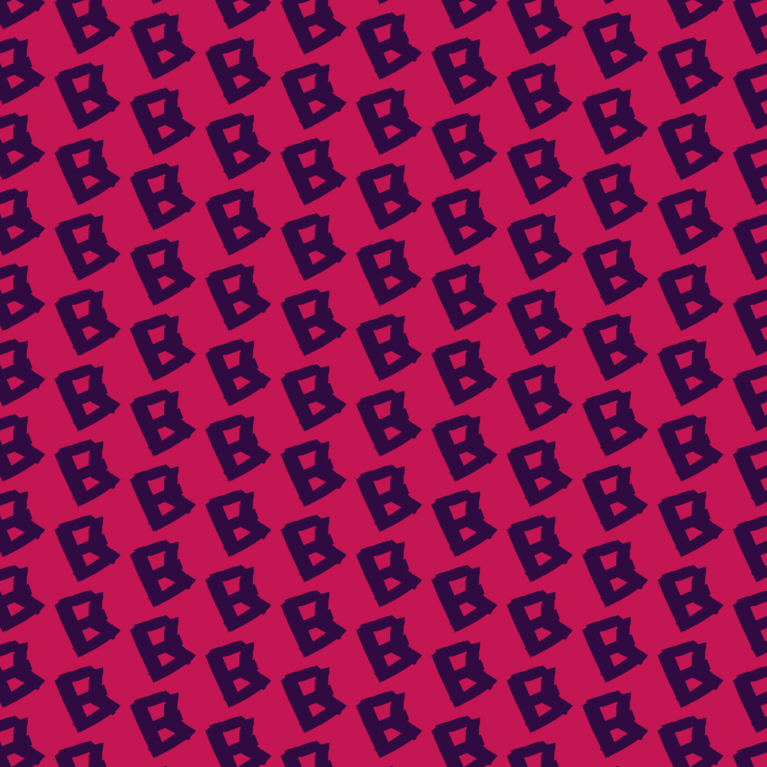
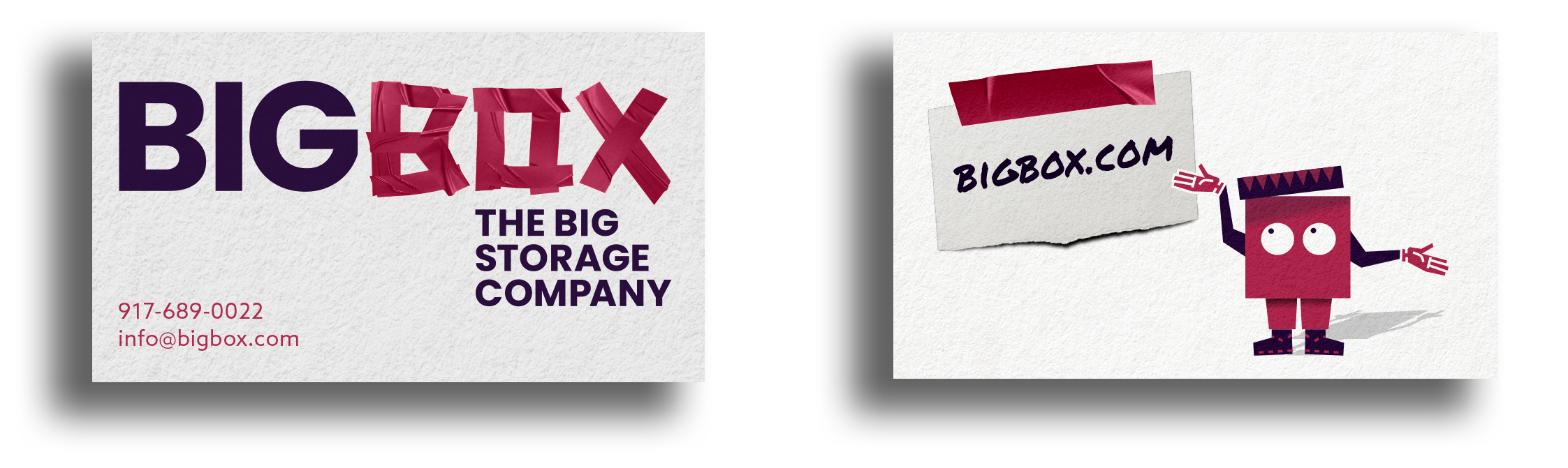
The logo for BIGBOX Storage is constructed from the simple form of packing tape, transforming an everyday moving essential into a bold and memorable brand mark. The tape lines intersect and wrap to create the shape of the word box, symbolising, security, strength, and protection. Subtle overlaps and clean edges reflect the precision and reliability of the service, while the continuous strip of tape suggests efficiency and seamless support from start to finish. By building the identity from such a recognisable storage material, the logo instantly communicates practicality, durability, and the promise that everything inside BIGBOX is securely sealed and taken care of.
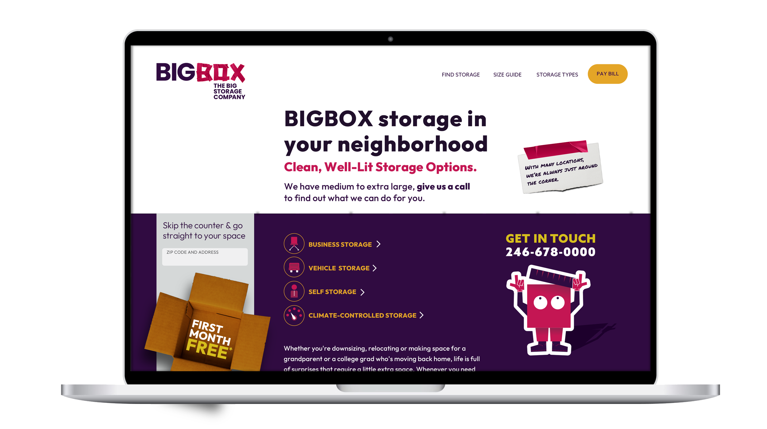
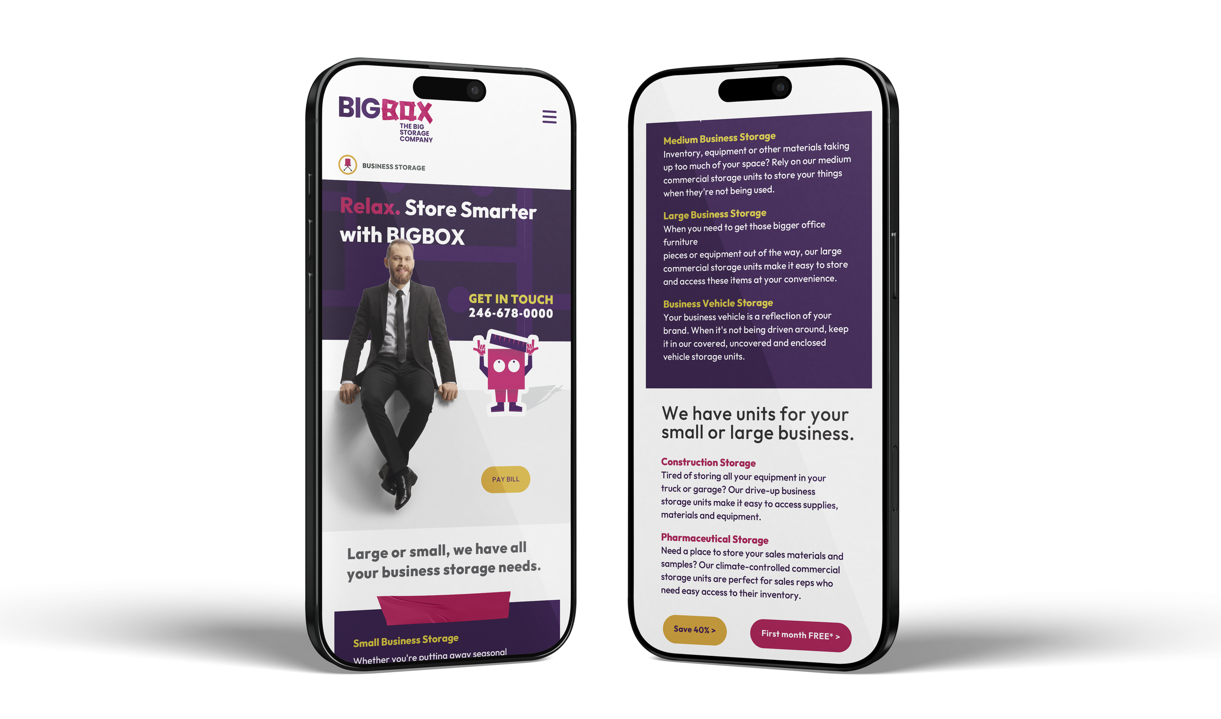

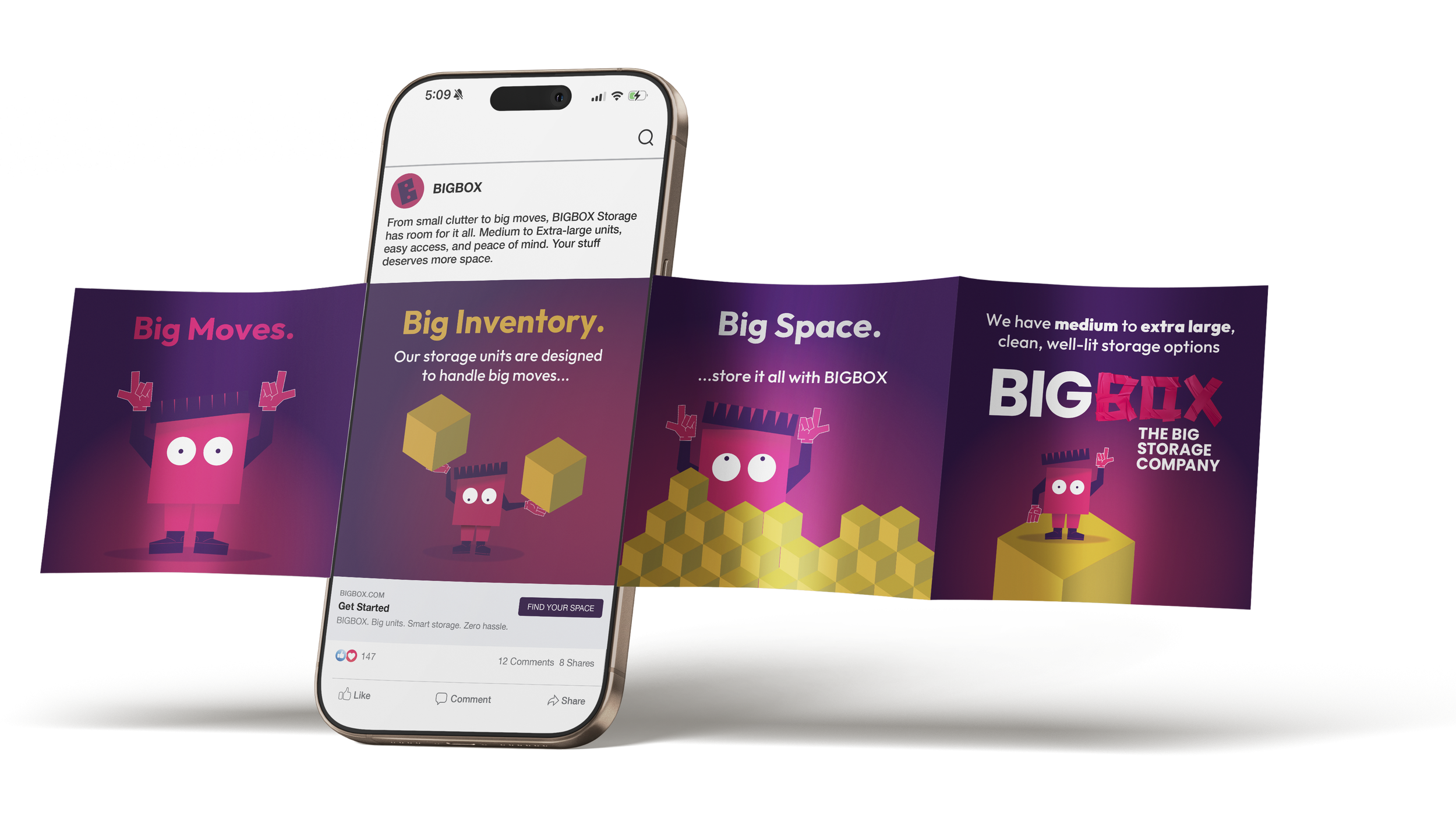
Illustrations of boxes are designed to bring warmth and personality to the BIGBOX brand, transforming a typically industrial product into something friendly and approachable. Simple and subtle expressions give each box a sense of character, helping to humanise the storage experience and reflect the helpful nature of the staff. Rather than feeling cold or purely functional, the boxes appear welcoming and dependable, visually reinforcing the idea that customers and their belongings are cared for. This playful illustrative style softens the overall brand, creating a balance between professionalism and friendliness that makes the company feel supportive, accessible, and easy to work with.


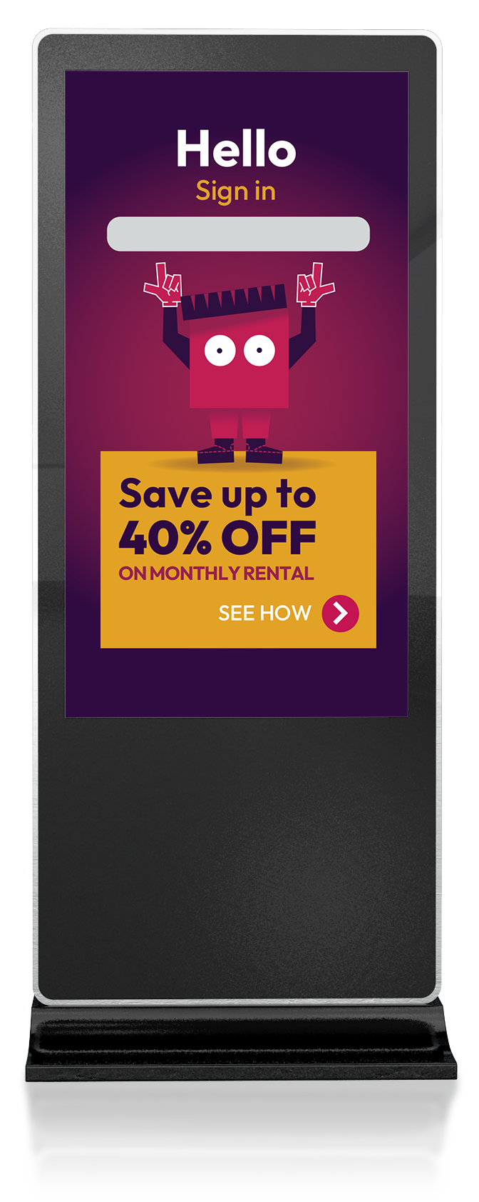
Reception screen
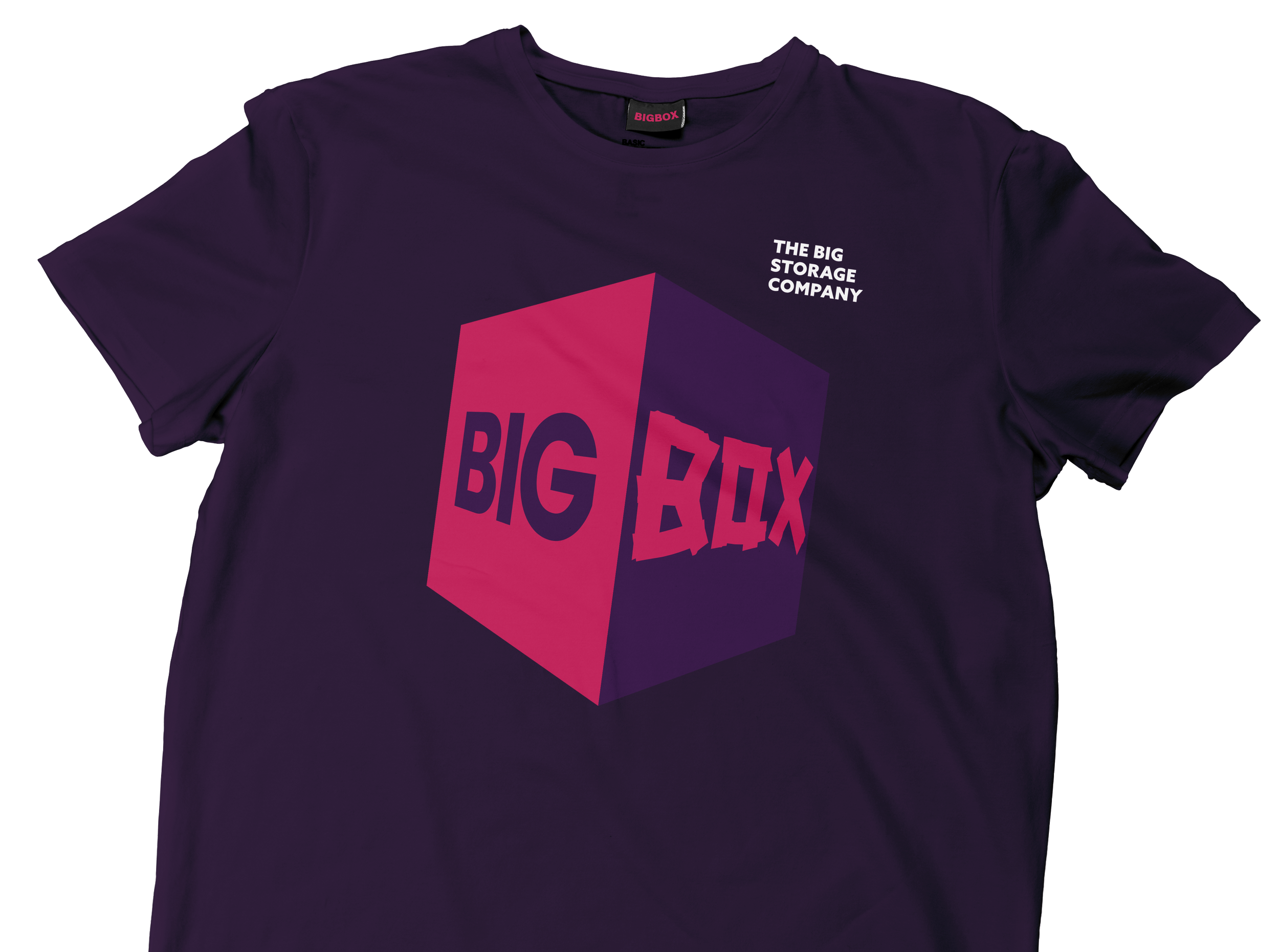
Staff Apparel