Lowe group
website design / branding / illustrations
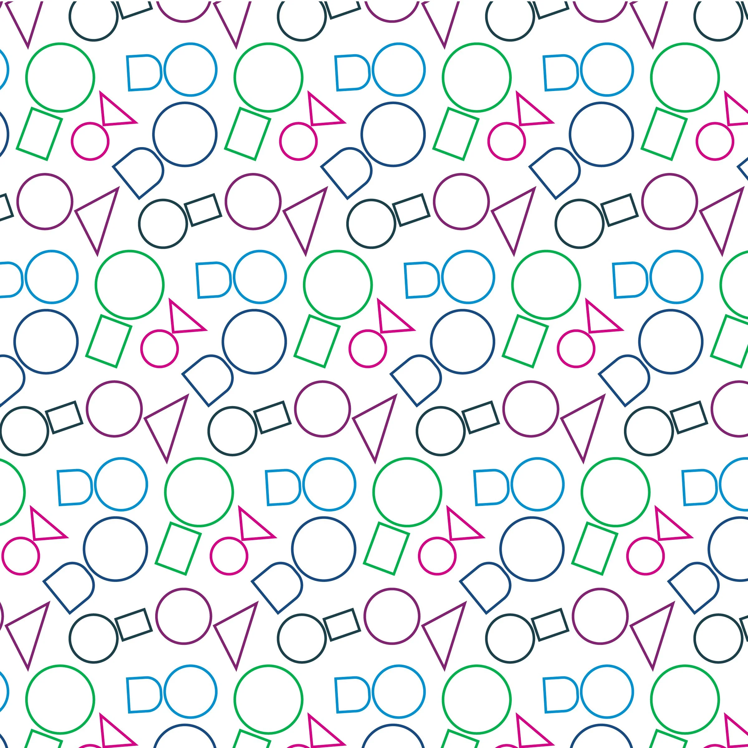
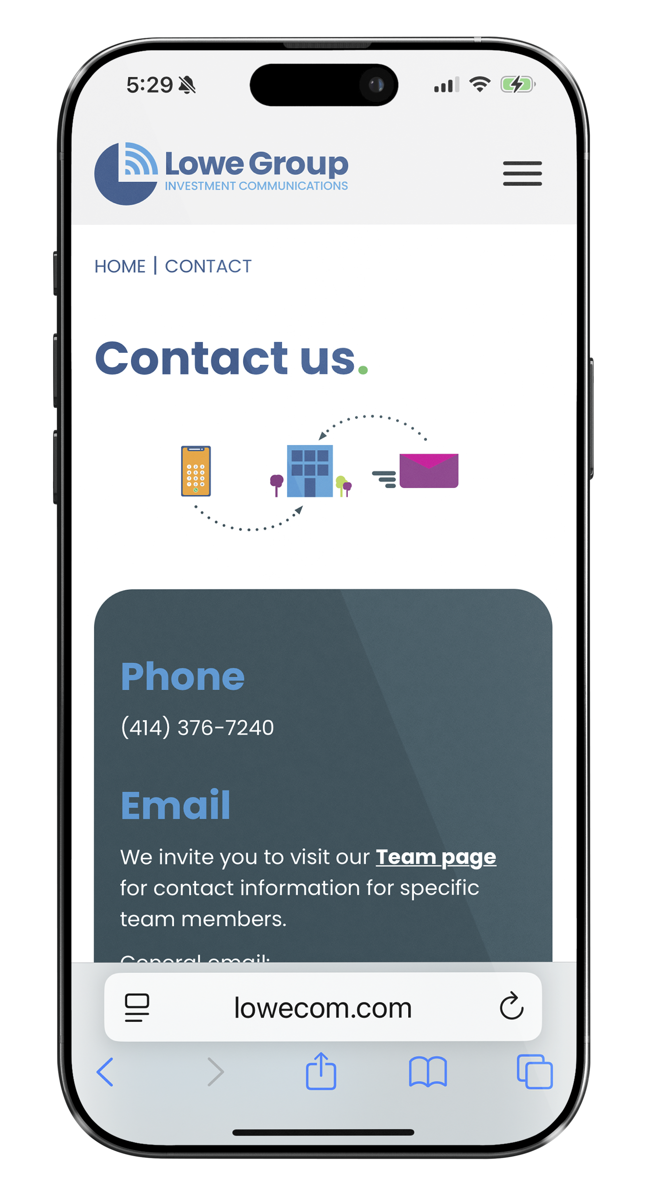
The design is based on approachability and simplicity.
Lowe Group = We’re approachable. We work with you.
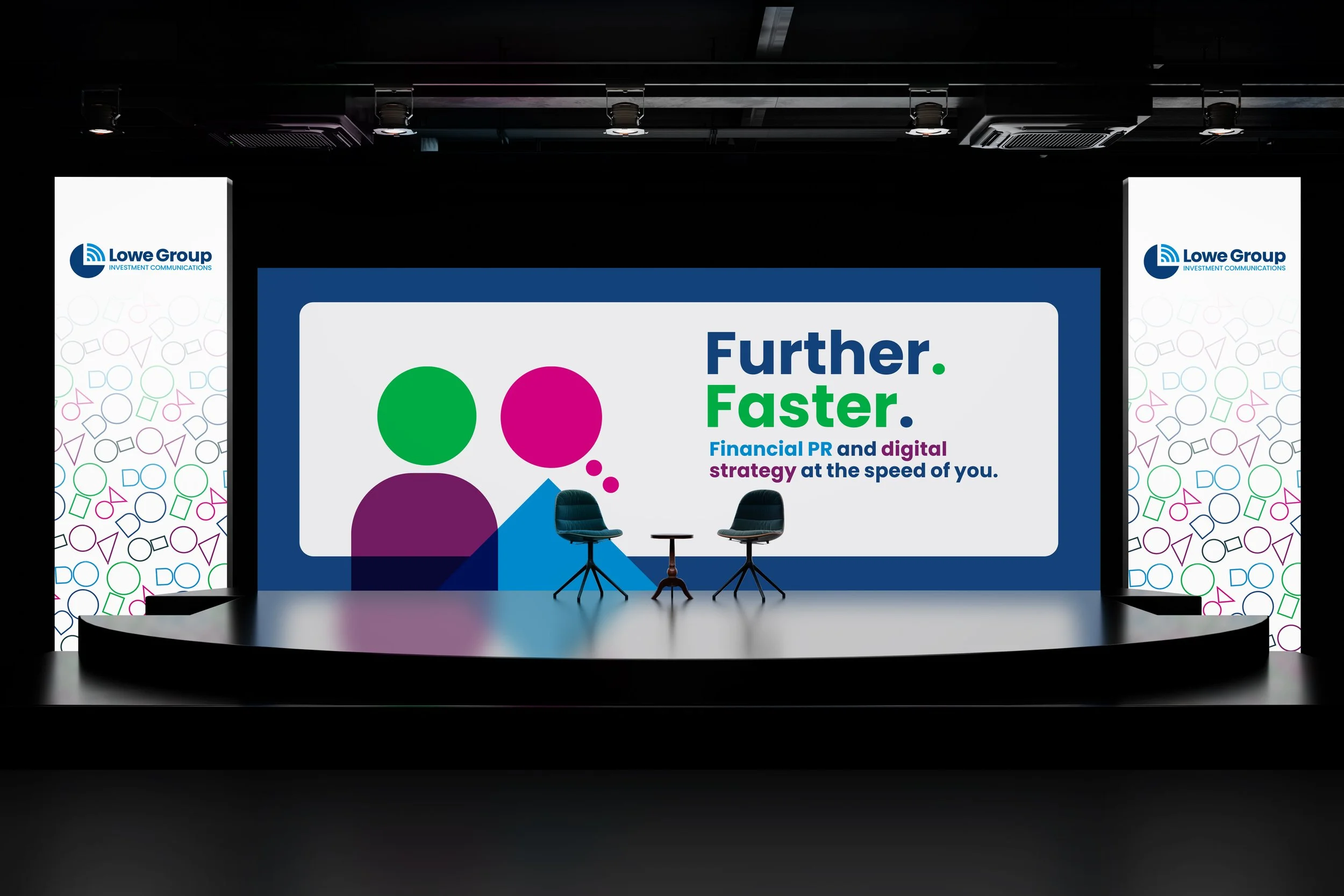
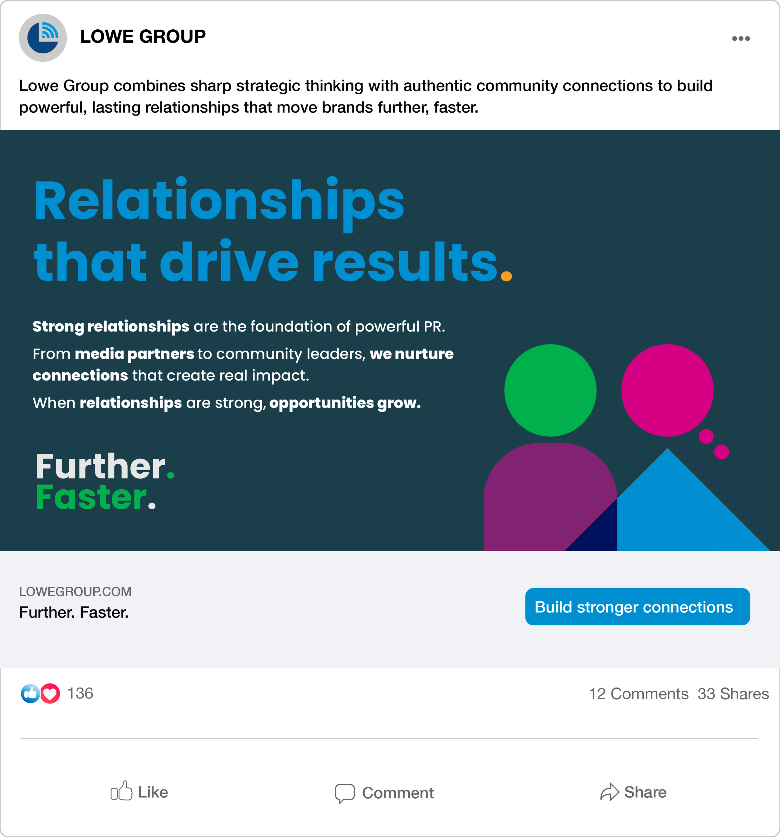
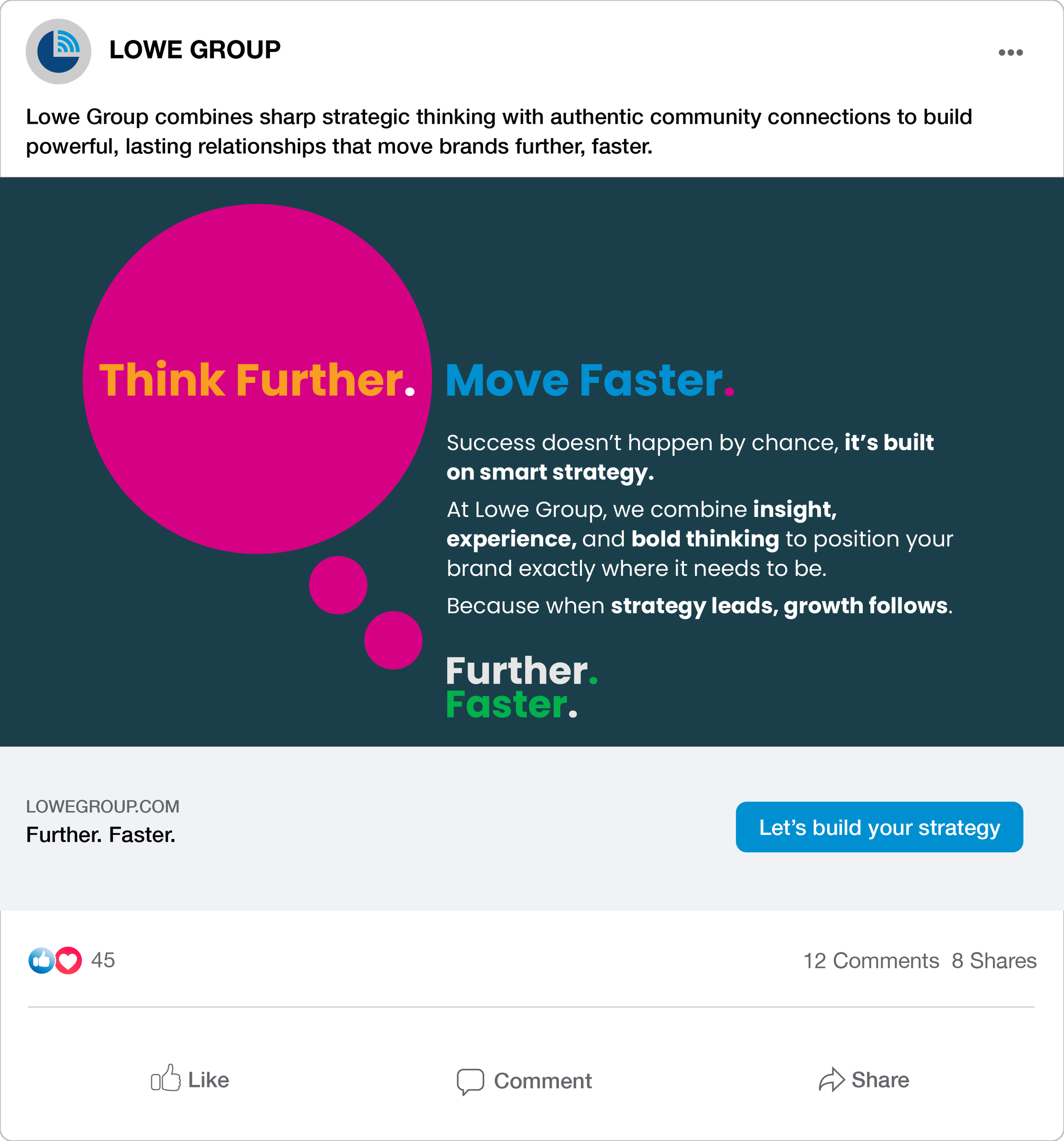
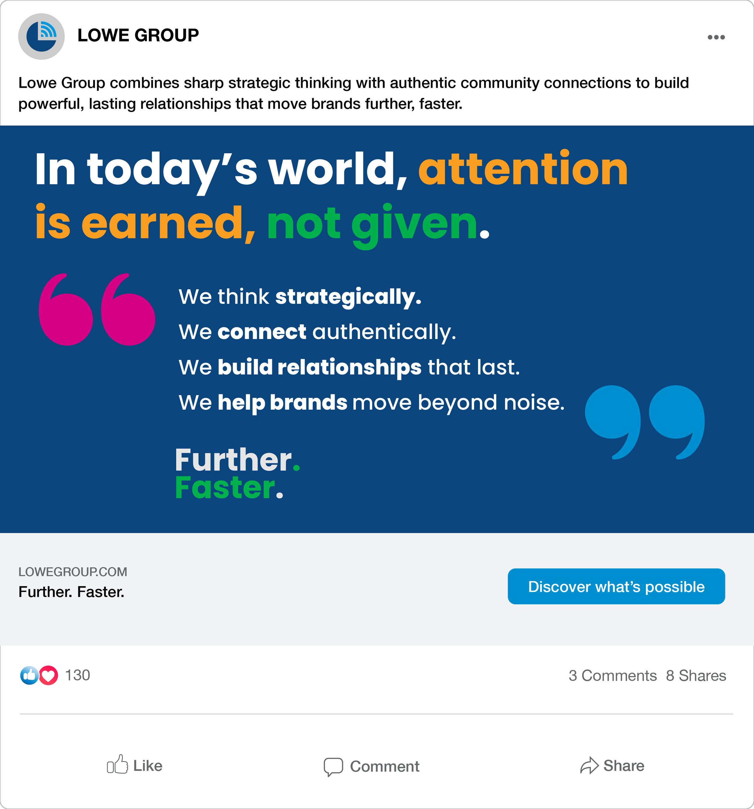
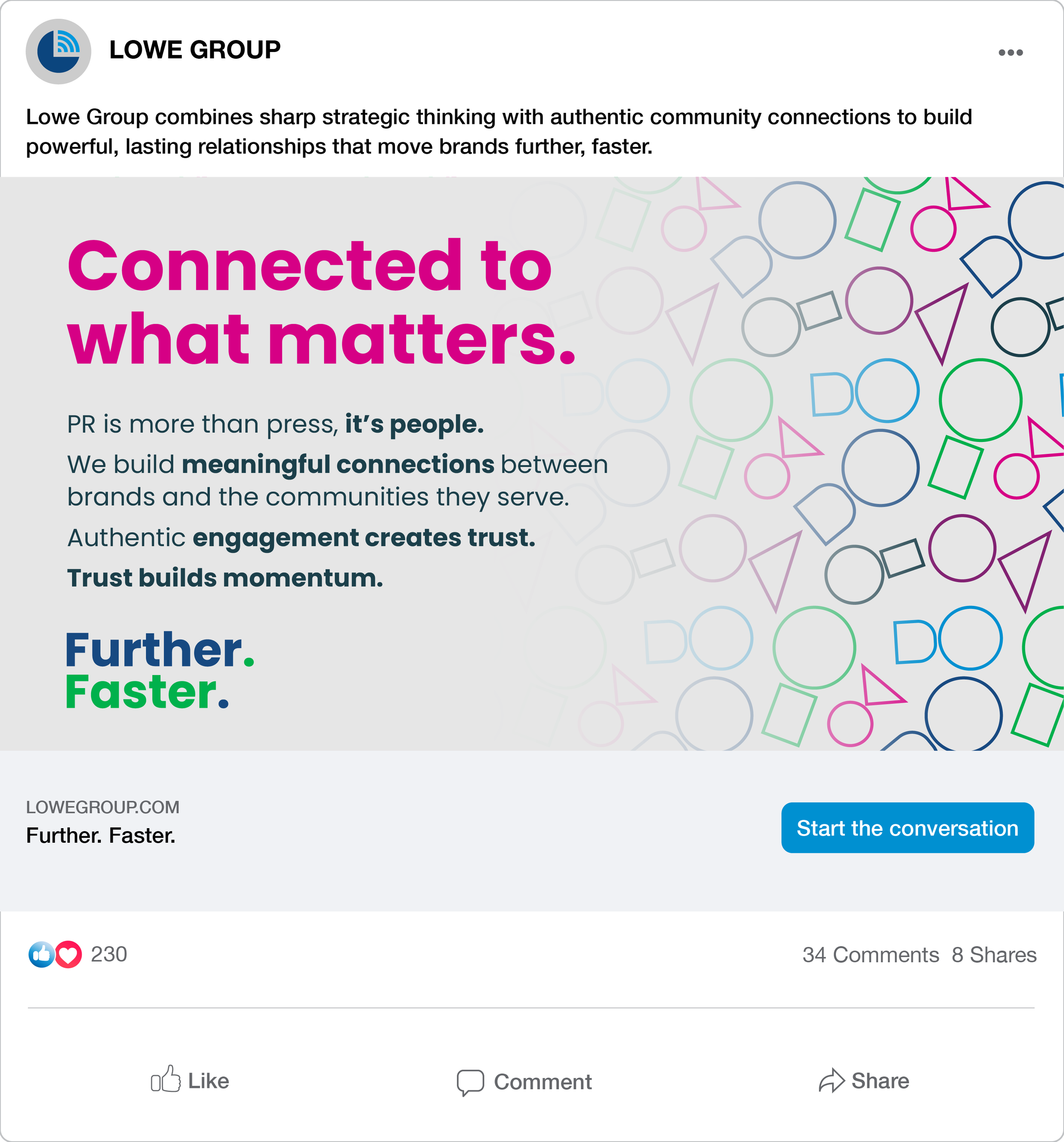
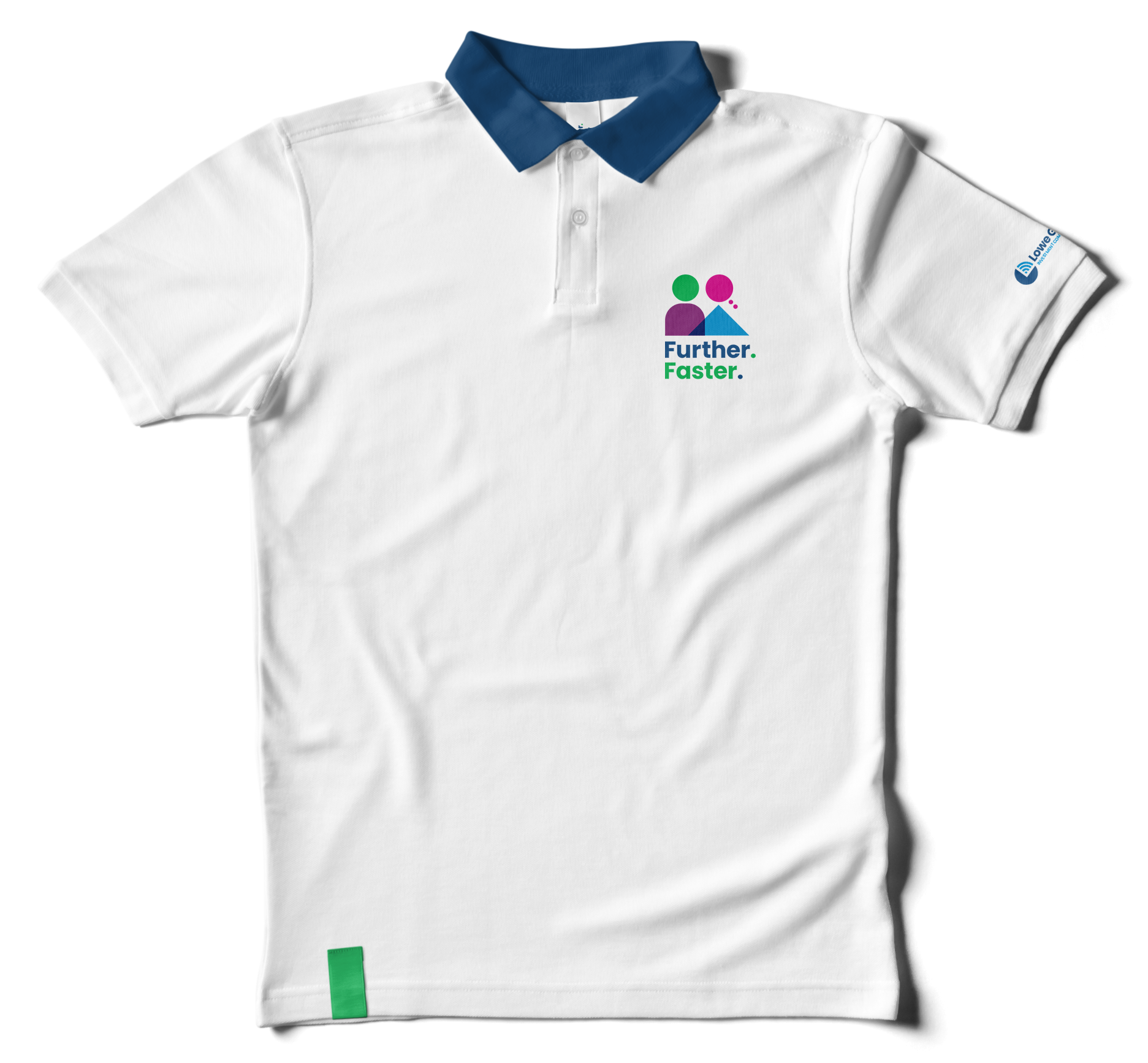
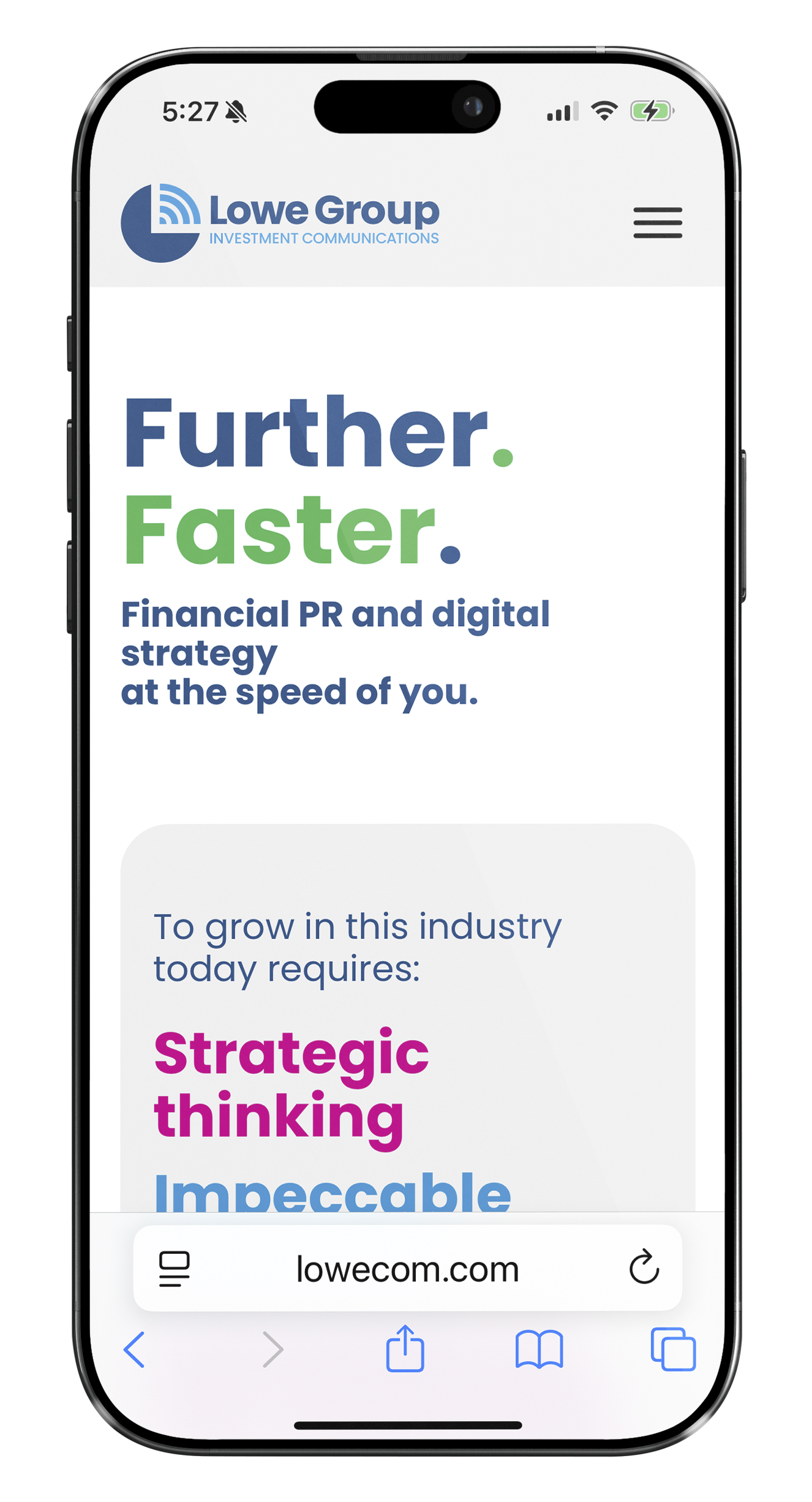
Lowe Group is a Chicago-based PR company built on the belief that strong communication starts with genuine connection. Their brand identity reflects that philosophy through a design rooted in approachability, collaboration, and simplicity. The bold “Further. Faster.” headline, portrays a sense of strength in directness. Clean, simple shapes form the foundation of the visual system, symbolizing clarity and structure, while friendly, welcoming colors bring warmth and personality to the brand. These same shapes are thoughtfully extended into the icons and graphic elements, creating a cohesive and recognizable branding. The result is a modern, confident identity that feels both professional and easy to engage with, just like the team behind it.

Each point is animated into the box with an accompanying graphic:
• Strategic thinking is a thought bubble
• Impeccable execution is a simple arrow pointing up
• Connection to the community uses a rounded top pillar that overlaps the arrow to form a “community” of buildings
• Strong relations adds a circle that becomes the “head” on the left figure, for a resulting image of two people working together.


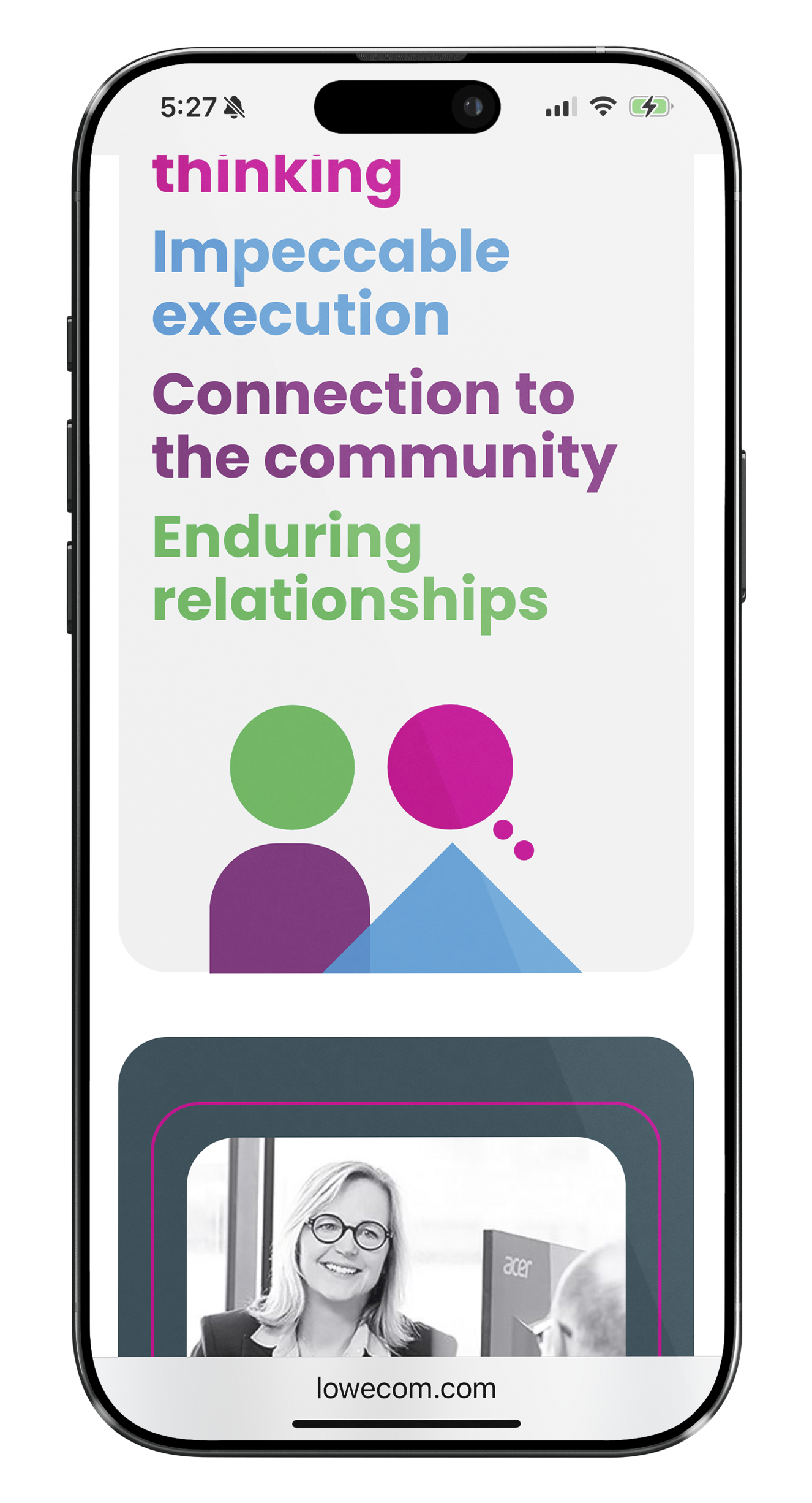


The simple shapes and bright colors used in this design lend themselves nicely to shapes that can be used through the brand system, for instance as shapes to hold quotes, etc.