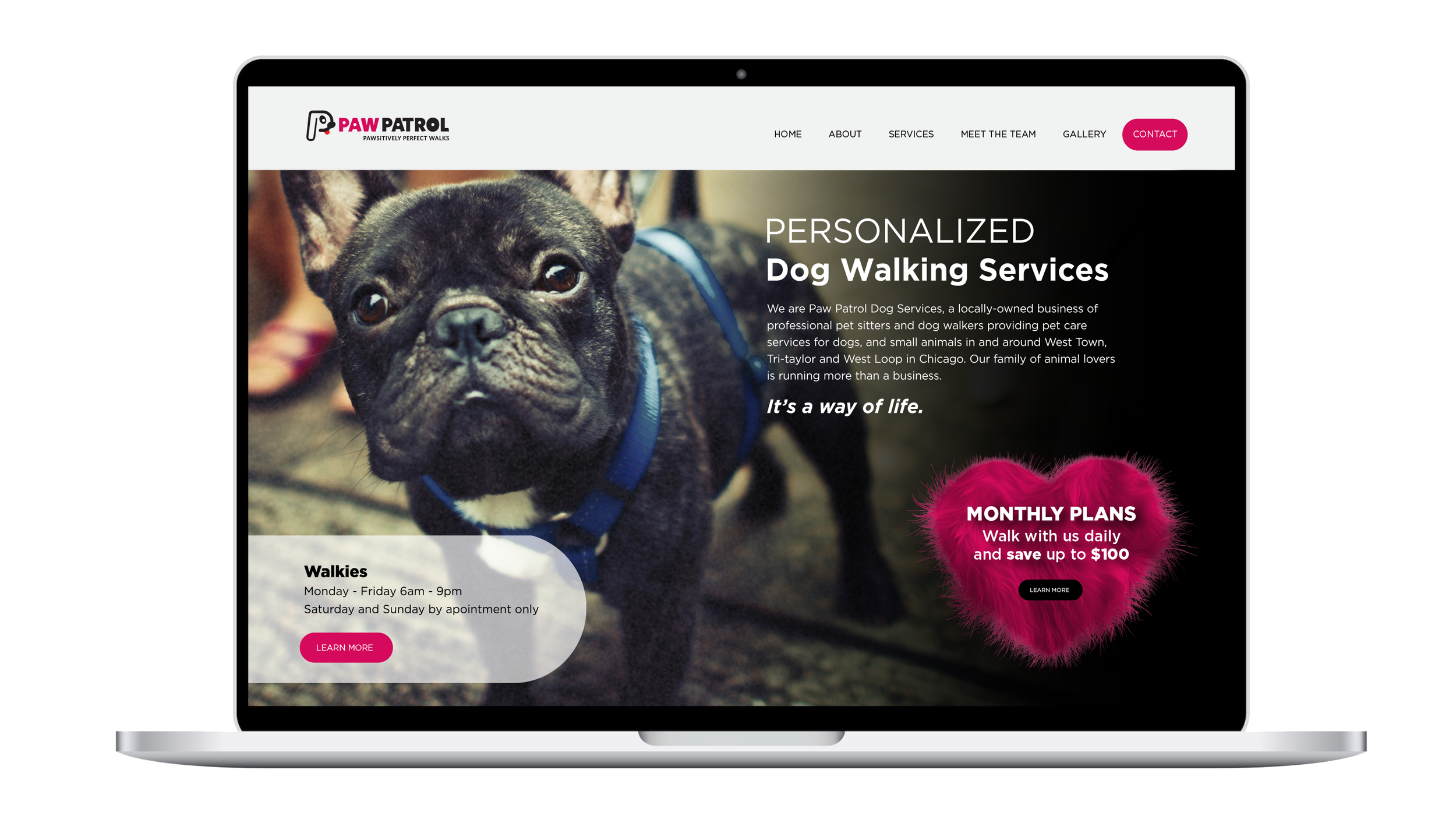
Paw Patrol - Chicago
brand identity / branding / digital design / icon design / print design
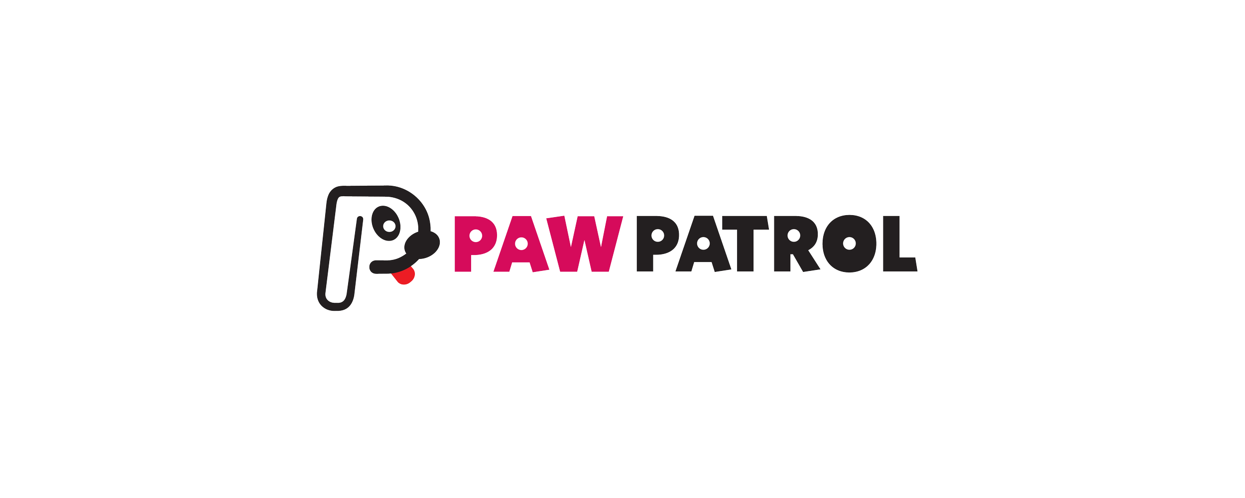
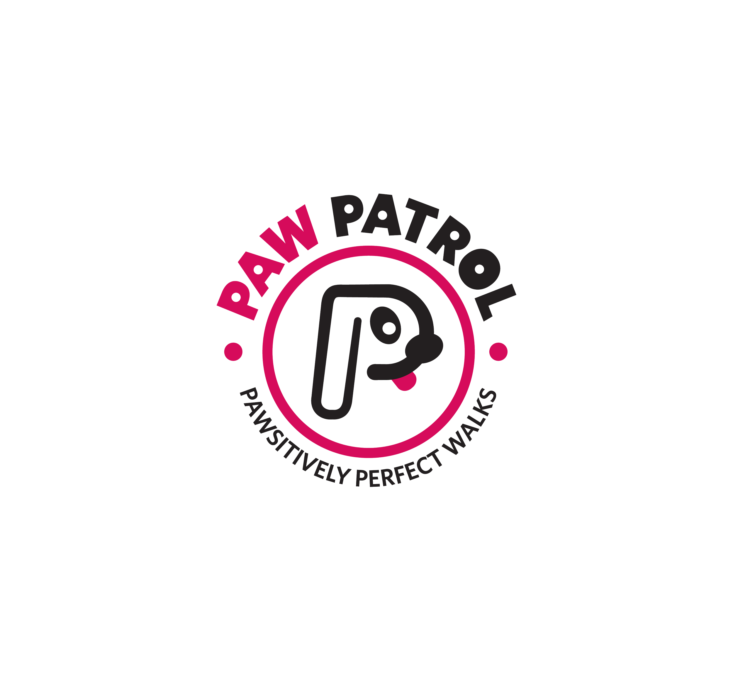
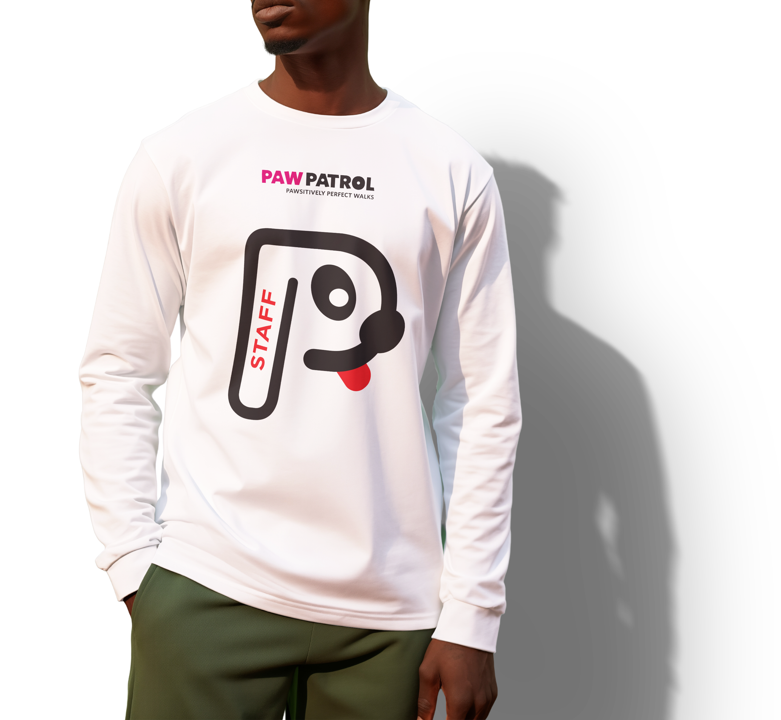
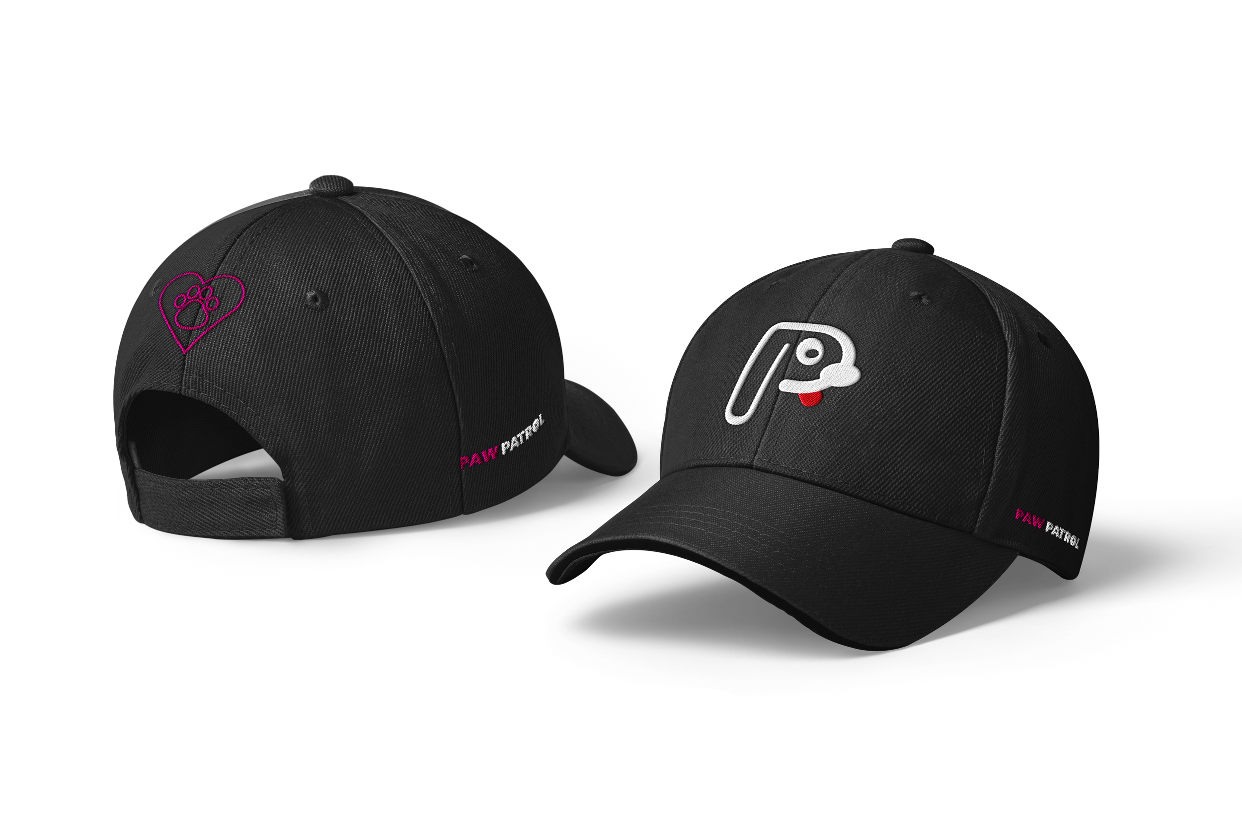
The logo creatively combines the image of a dog with the letter “P” from the name Paw Patrol, forming a strong and memorable visual identity. The shape of the “P” is designed to subtly outline the silhouette of a dog, symbolizing loyalty, protection, and companionship. By merging typography with a recognizable canine form, the logo becomes both playful and meaningful, This fusion of letter and character creates a bold, friendly mark that is easy to recognize and reinforces the brand’s focus on dogs and teamwork.
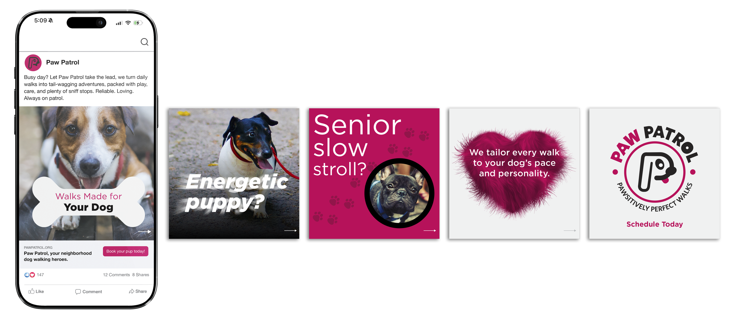
Paw Patrol’s logo comes to life through its playful typography and bold use of magenta, creating a look that feels energetic, friendly, and full of personality. A thoughtful detail lies in the small circles within the typography, which subtly echo the circular shape found in the eye of the logo mark. This repeated element creates visual harmony across the design, tying the logo type and logo symbol together in a cohesive, playful way that feels intentional and memorable.