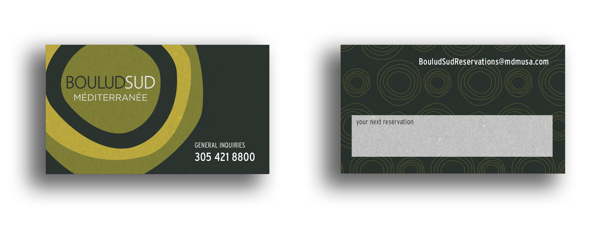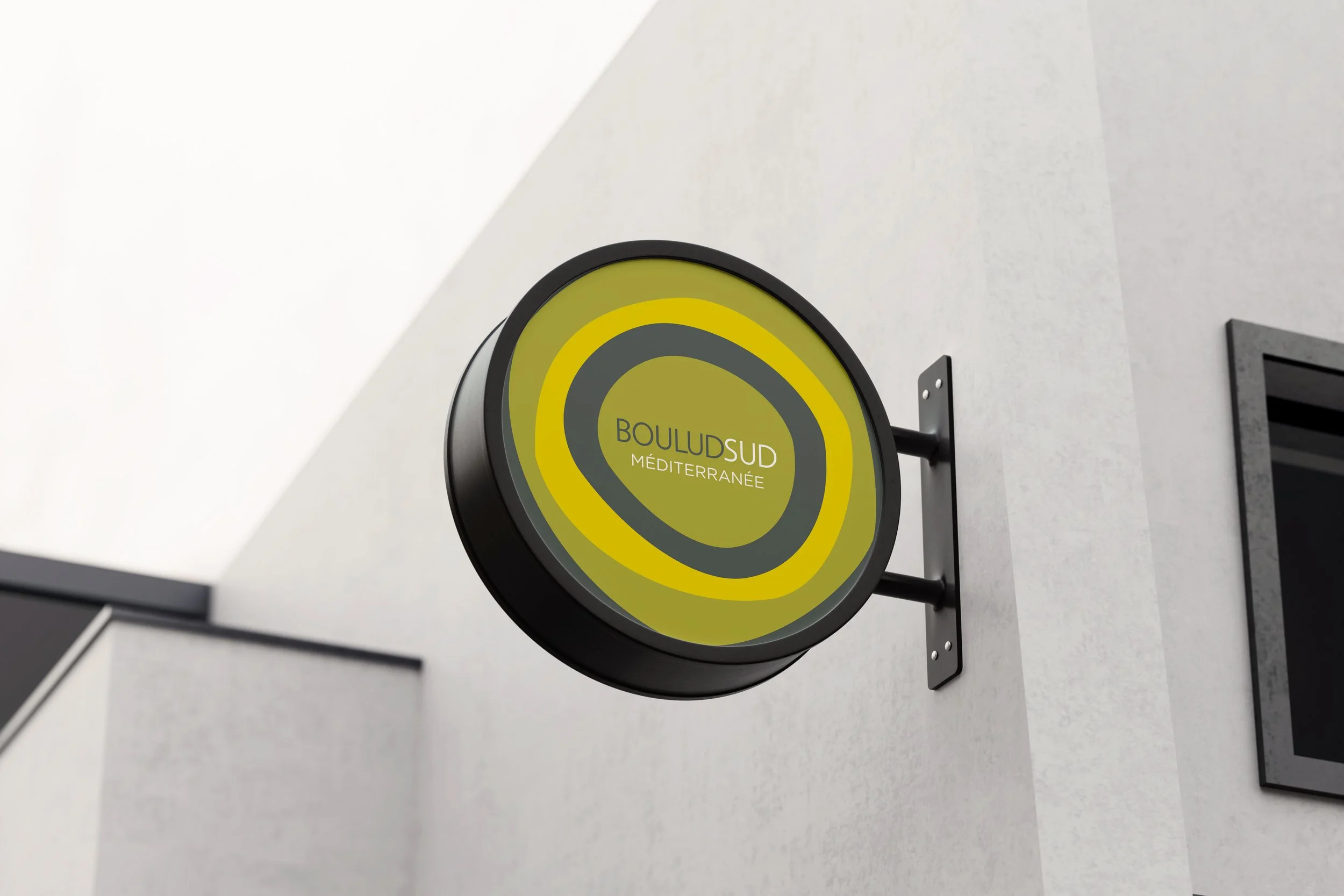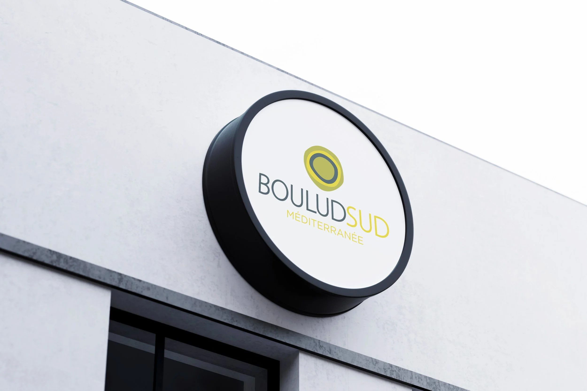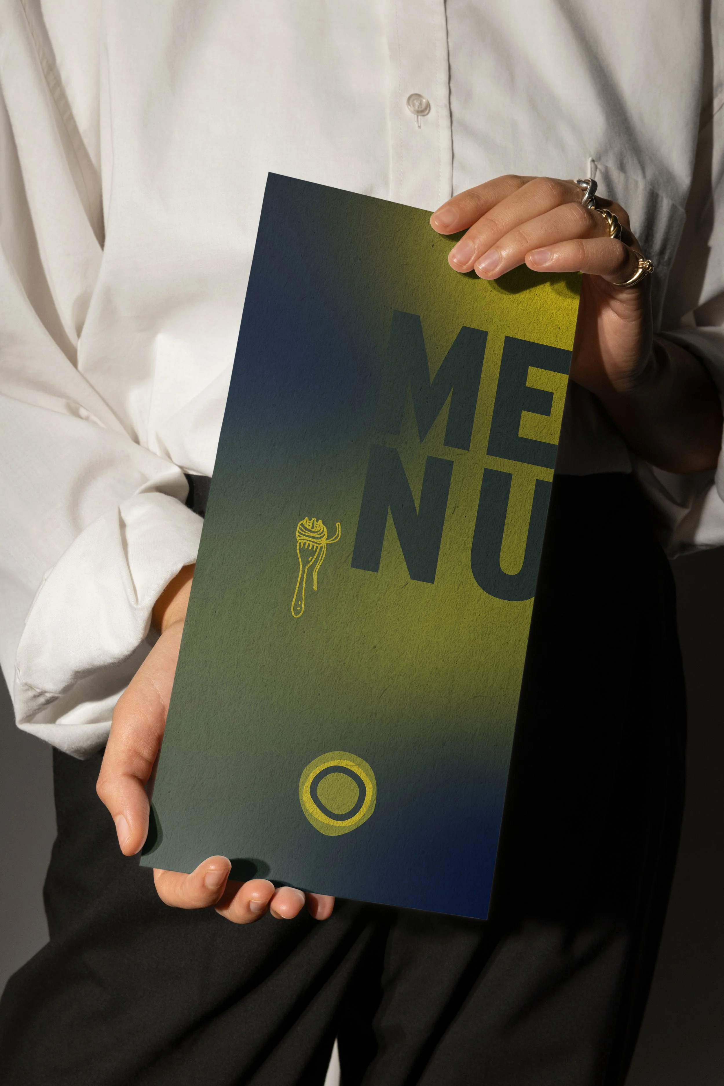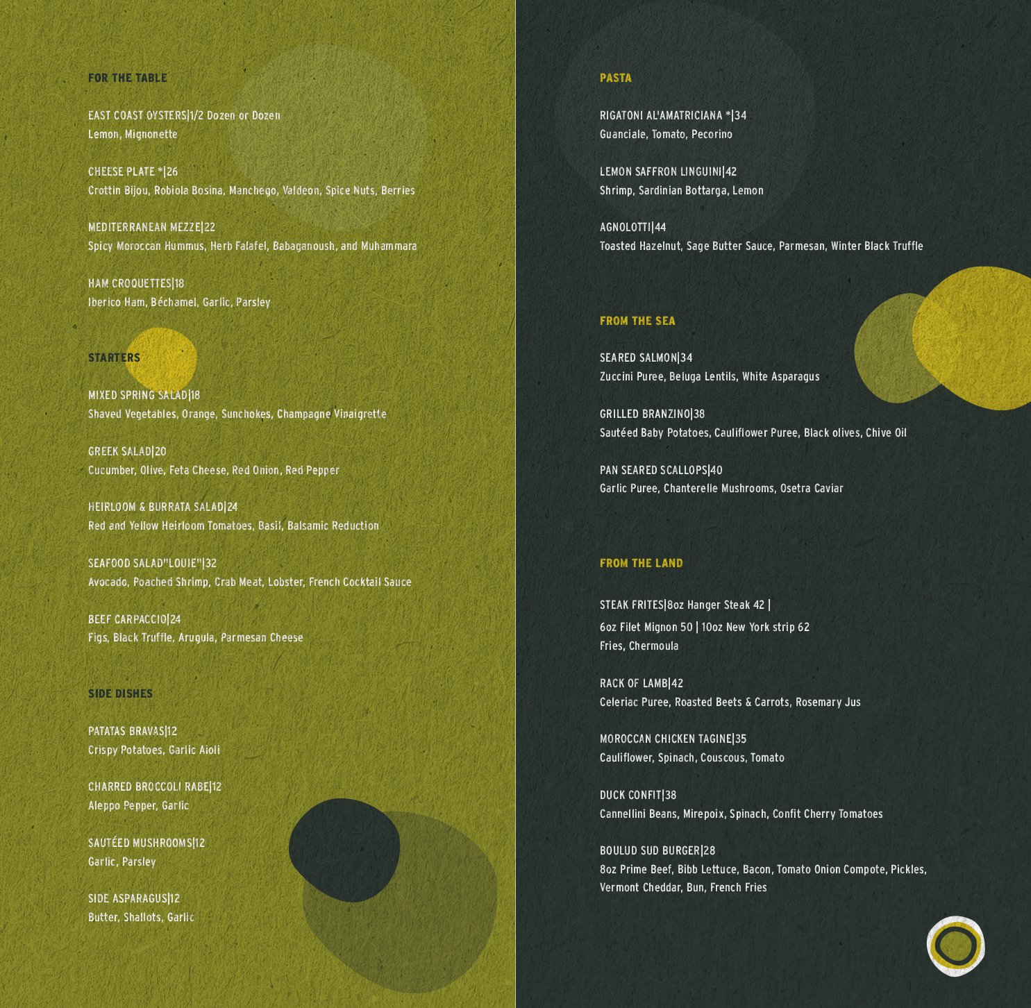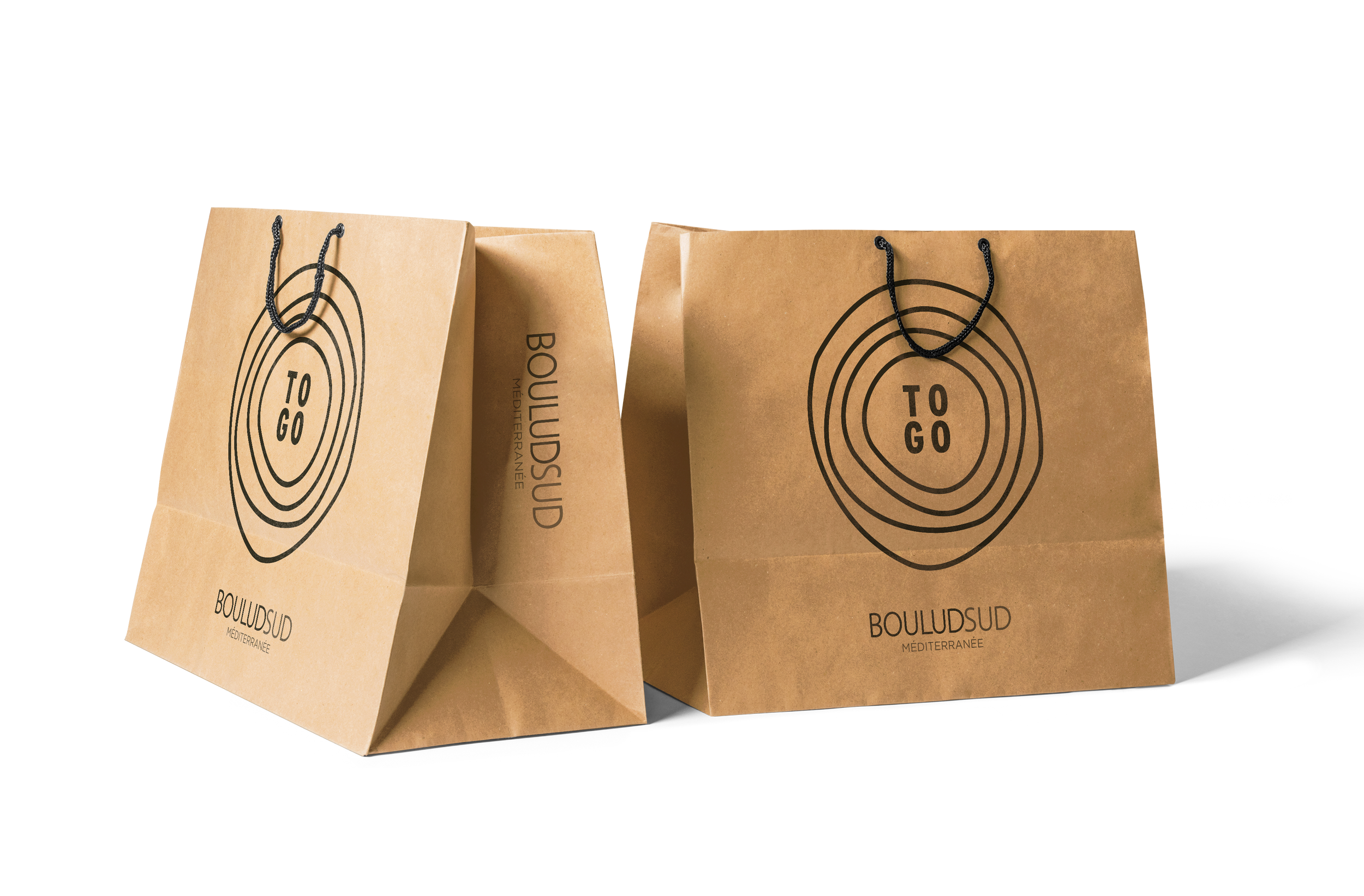
BOULUDSUD
logo design / branding / print materials / signage / video
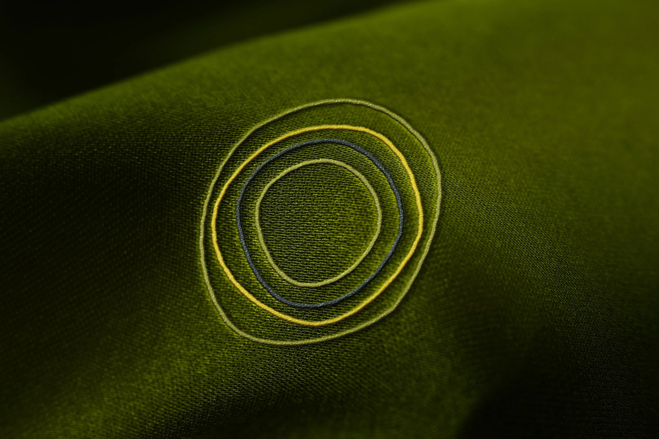
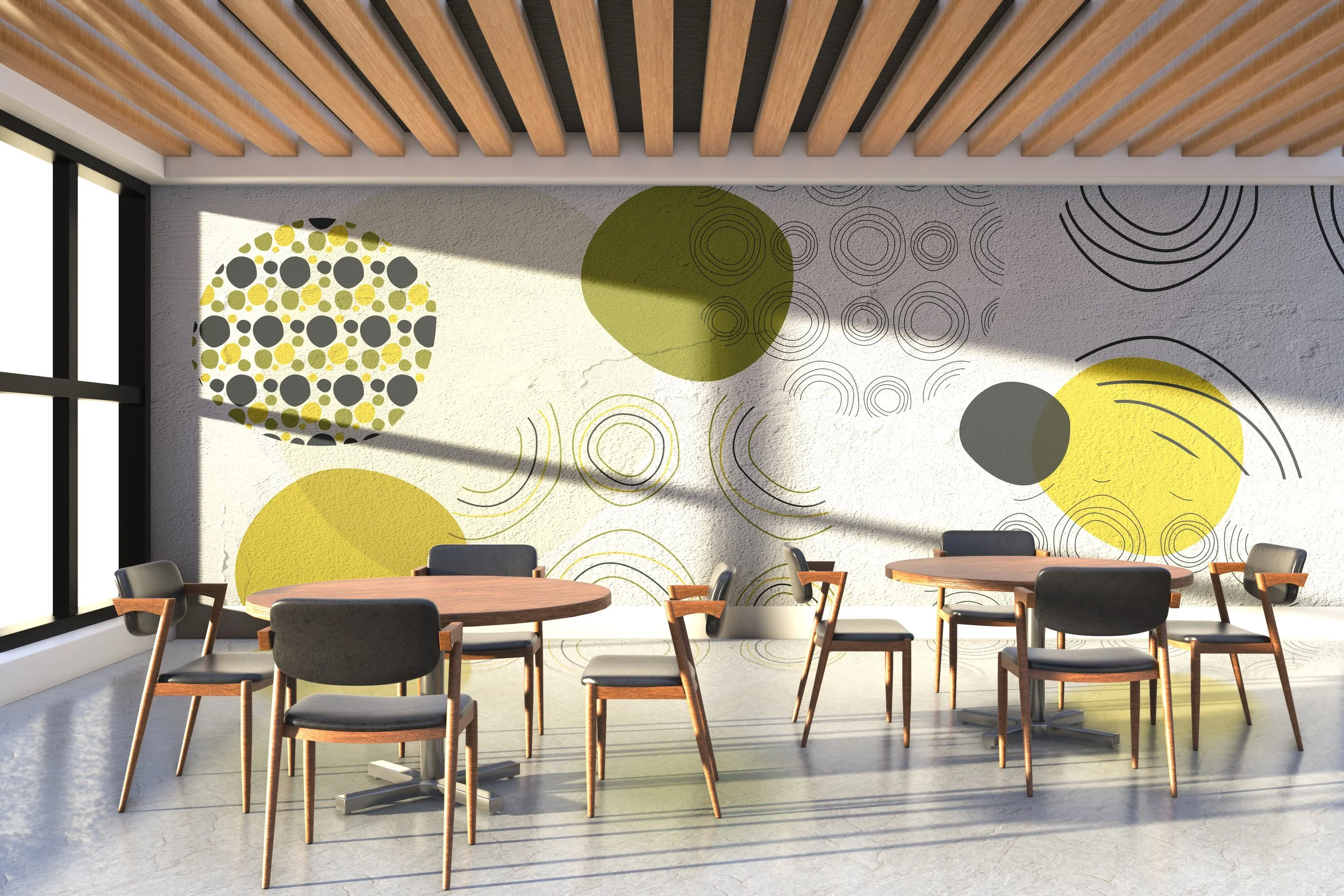
The logo is inspired by a simple yet powerful moment, splashes of olive oil. Its fluid shapes and organic movement reflect freshness, authenticity, and the richness of natural ingredients. The design captures the essence of quality and craftsmanship, transforming a dynamic splash into a memorable visual identity that feels both elegant and alive.
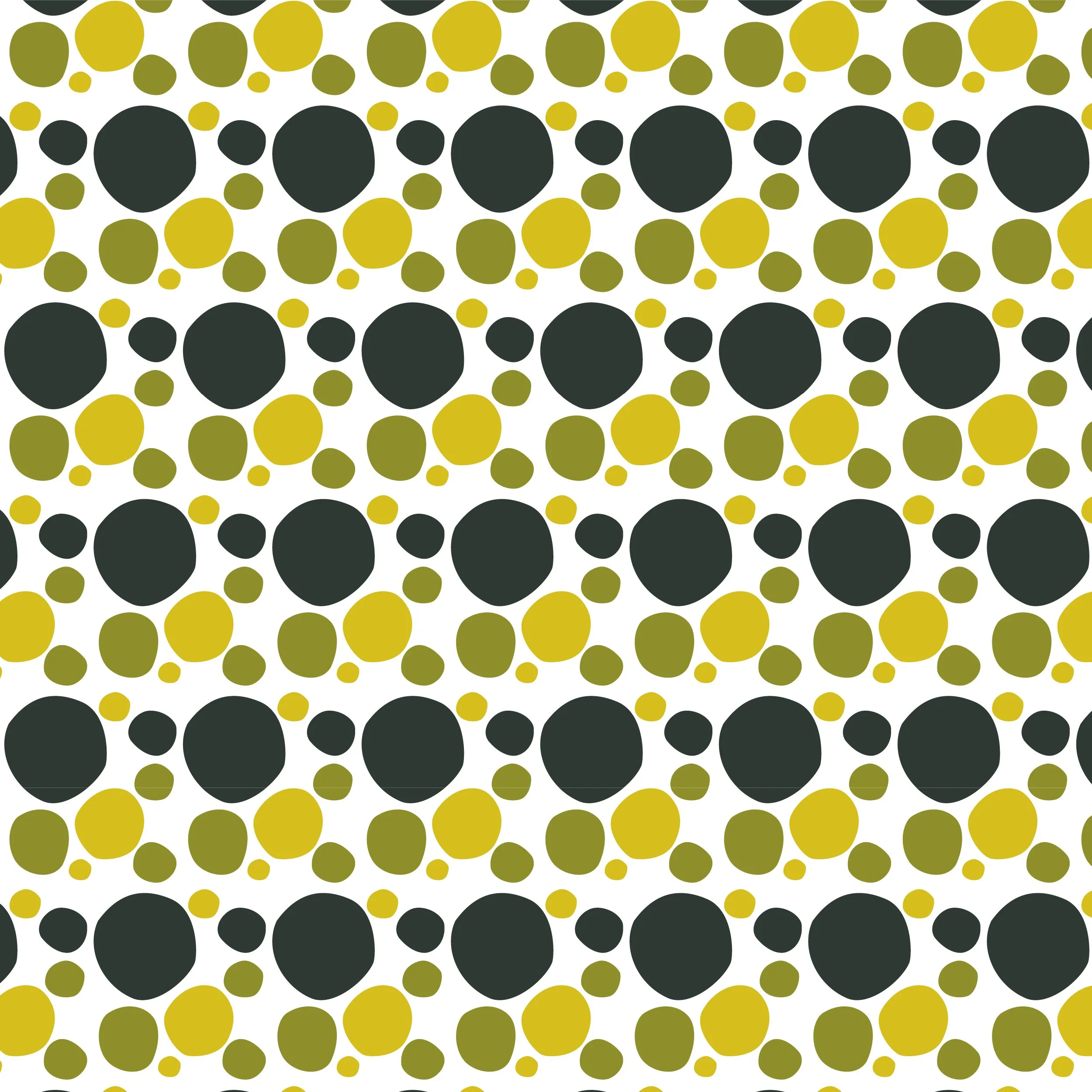
Different olive colors were used in a logo design. The olive (oil) colors tie in with the different olive oils used within the cooking. The different olive colors add depth, meaning, and versatility while staying within a cohesive palette.
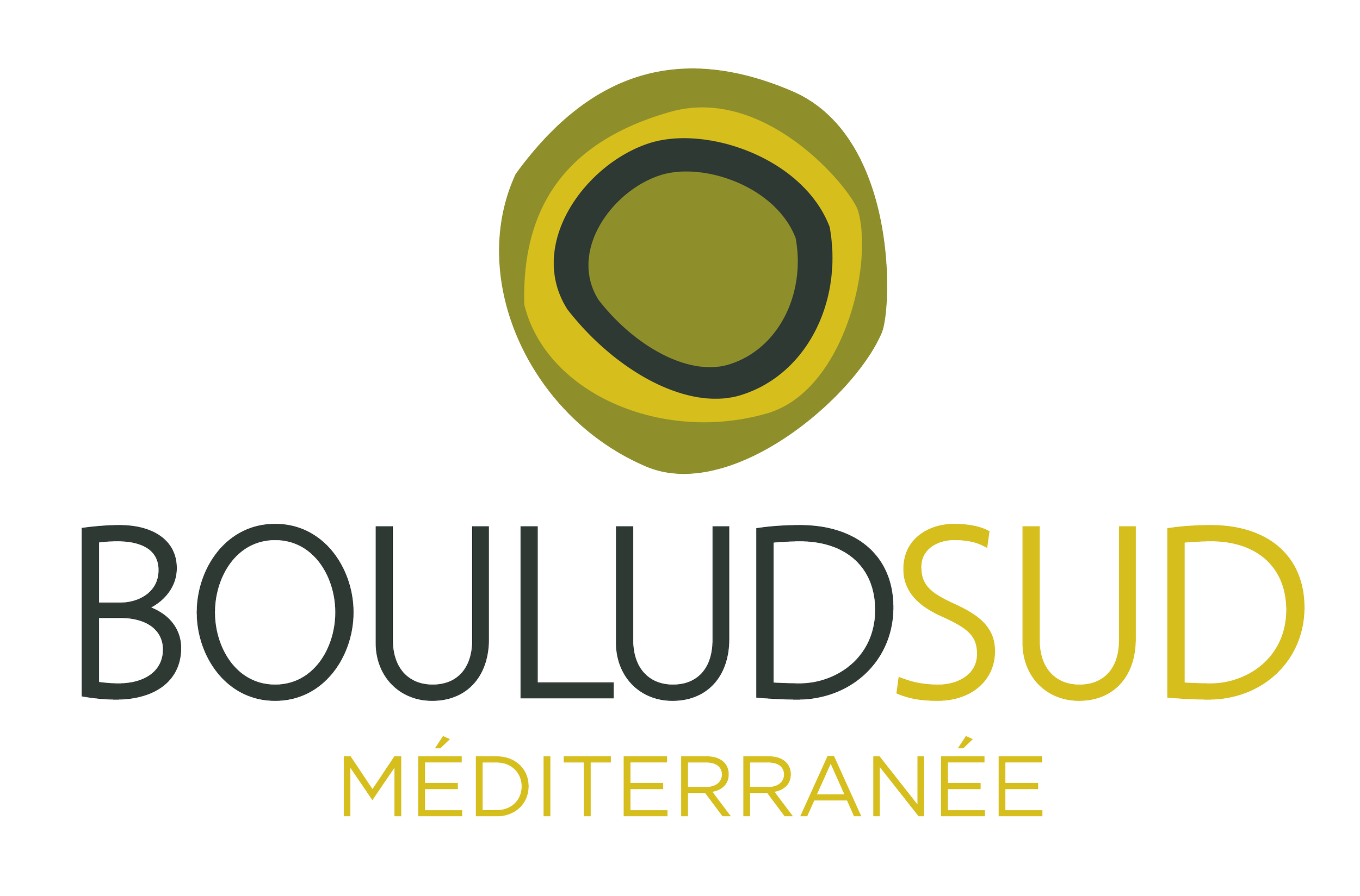
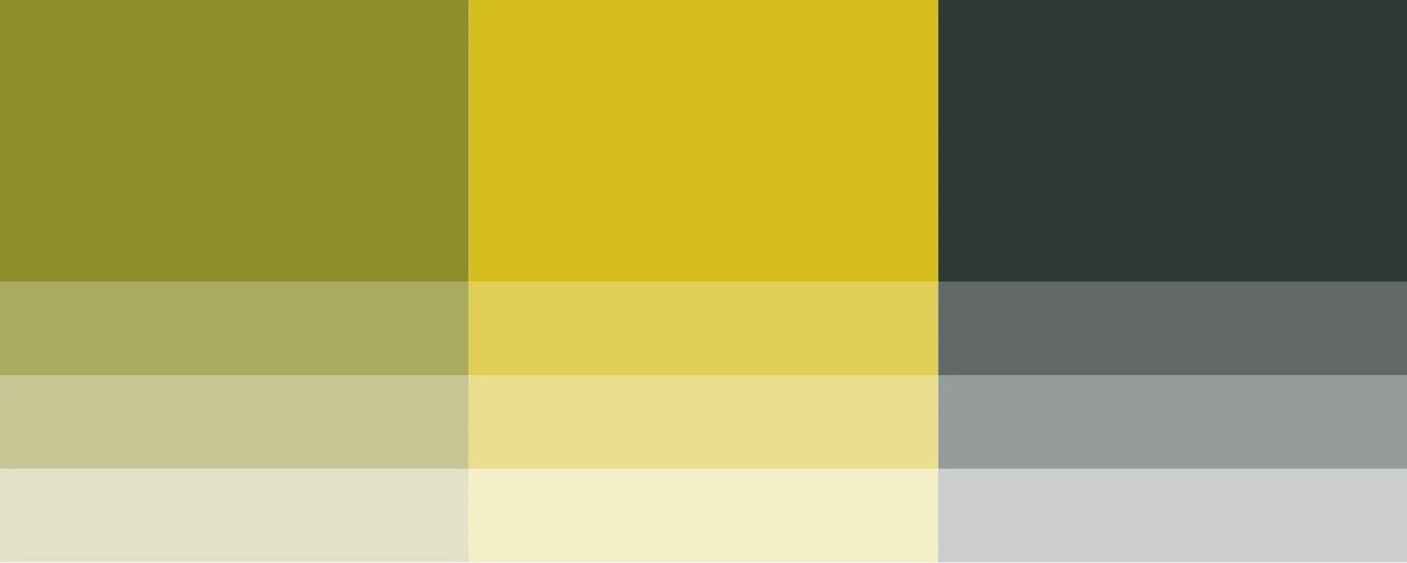
Three olive colors, including light, medium and dark make up the palette. Light olive color conveys warmth, optimism, and approachability. It feels fresh and inviting, making it appear friendly, artisanal, and modern. Medium olive color balances vibrancy with earthiness. It suggests quality, heritage, and authenticity, often used by food, lifestyle, or craft-focused brands to communicate richness without being overpowering. Dark olive adds sophistication and stability. This darker tone feels grounded and timeless, evoking trust, tradition, and reliability, anchoring the visual identity.
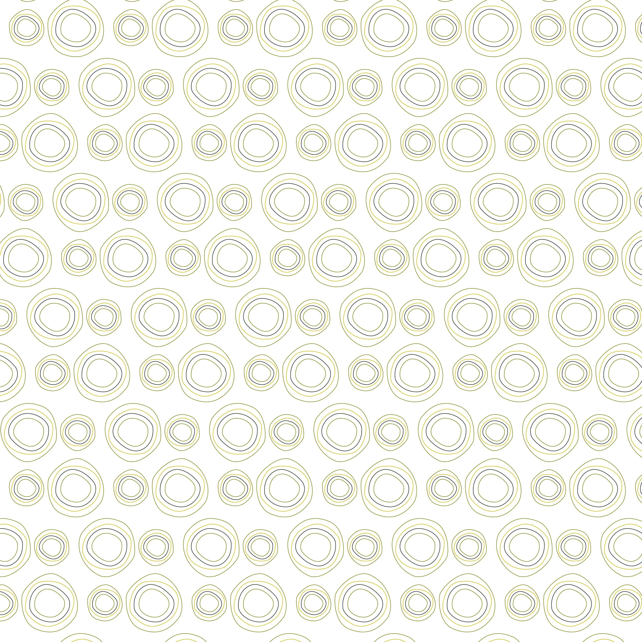
Together, these variations create visual hierarchy and flexibility, allowing the logo to adapt across different backgrounds, sizes and applications while maintaining a consistent, recognizable identity.